Home and Learn: Power BI 2023
The Power BI Slicer
A slicer is like a toggle button. As an example, you might have a column of data for Males and Females. By selecting an option on your slicer, Power BI will apply the filter to the data, showing you just the Males or just the Females. If that's not too clear, some practical work might clear things up.
What we'll do is to try an answer the following question: How many pet owners were male and how many female?
If you haven't already done so, download the pet data CSV file here:
Load it into Power BI, just like you did previously.
Now add a table visual to your dashboard:
Toggle the Build a Visual panel by clicking the icon in the top right of the table. From the panel, click the Add data button. Then select the Pet item:

What we need is a count of the OwnerGender column. This will tell us how many owners were male and how many female.
Click the Add data button again. This time, add the OwnerGender column. Your table will look like this:
Not quite what we want.
Right click the OwnerGender item in the Build a visual panel. From the menu, select the Count option:

Your table will then turn into this:

Getting there.
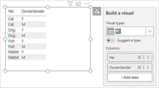
Click the Add data button again. Add another OwnerGender column. Your table will look like this:

You can just about understand the data. At the top, we can see that 5 Females owned cats while only 2 males did. But the data in the table is a bit messy. We can clear things up with a slicer.
Add the Power BI Slicer
The slicer visual is meant for categorical date. It enables you to select only the category you're interested in, like males or females. The other visuals on your dashboard will then update accordingly. The slicer visual is more often seen with dates. Let's add one, though, so you can see them in action.
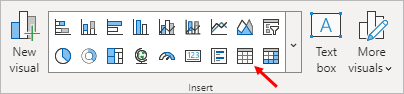
First, click a white area of your dashboard. This will deselect any visuals you have selected. From the Home ribbon at the top of Power BI, locate the Insert panel. Click the Slicer item, indicated by a red arrow in the image below (the first icon from the right on the top row):

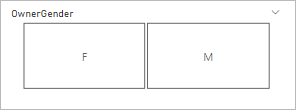
When you add a slicer, it will look like this on your Power BI dashboard:

Now you have to tell Power BI which category you want to slice on.
Click the Add data button. From the Select data menu, select the OwnerGender column again. The slicer will then look like this:

Click either the F or M box and watch what happens to your table:

That's much clearer! We've selected the F option in the slicer. In the table, the M values have disappeared. We can now better see that 5 of the cat owners are female, while 4 of the dog owners are. Females own 1 Fish and 4 rabbits.
To get all the values back, just select the F option again.
Formatting Power BI Slicers
You may not like the default slicer, which is selection boxes. In which case, you can change them to either buttons or dropdown lists.
Click the little paintbrush icon to the right of the slicer. Then click the More Options button to bring up the Format panel on the right of Power BI. The one to expand is Slicer Settings:

Click the dropdown under Style to see the following options:

So you can have Vertical List, Tile, or Dropdown. Select the Tile option and you slicer will chance to this:

If your prefer, the tiles can be horizontal rather than vertical. All you need to do is change the height of the slicer. Drag the middle bottom sizing circle upwards:

Let go of your left mouse button and the slicer will change to this:
The dropdown option is fairly self-explanatory. Give it a try to see if you like it.
We'll meet slicers again, when we do one for dates in a later tutorial. For now, let's move on. Let's do some more on charts, as they usually form the basis of any dashboard. We'll tackle line charts and chart formatting.
<--Back to the Power BI Contents Page