Home and Learn: Power BI 2023
Power BI Line Charts
In this lesson, you'll see how to add a line chart to your Power BI dashboard. You'll also learn how to format charts in more detail than we've done before.
We'll use some very simple and made-up sales data, for this tutorial. Download the file here (right-click, Save As):
The file is an Excel one. Start Power BI. Go to File > Get Data > Excel Workbook. Load the file you've just downloaded: (No need to transform it.)

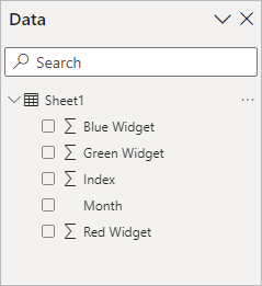
In the Data panel on the right of Power BI, you should see this once it's loaded:
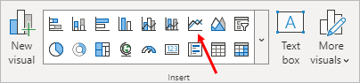
From the Home menu at the top of Power BI, locate the Insert panel and the line chart item, indicated by a red arrow in the image below (third from the right on the top row):
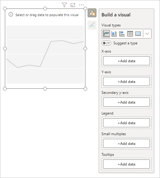
When you insert a line chart, you'll see this appear on your Power BI dashboard:
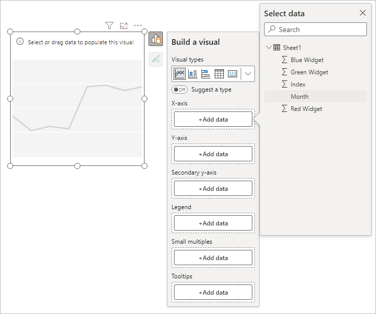
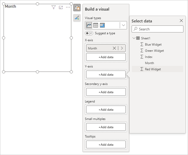
From the Build a visual flyout, click the Add data button under the X-axis heading. Add the Month item:
Click the Add data button under the Y-axis heading. From the flyout, add the Red Widget item:
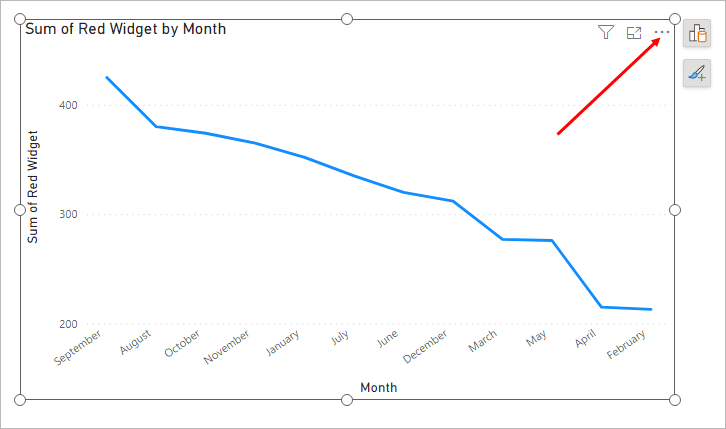
Your chart will look like this:
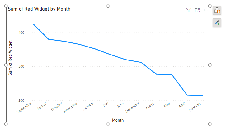
On the face of it, this looks like we're trending downwards for sales. However, notice the months on the X-axis. They start at September and end in February. Power BI is taking the highest value and using that on the left. The lowest value is on the right. What we'd like to do is to order the X-axis by month, starting with January and ending at December.
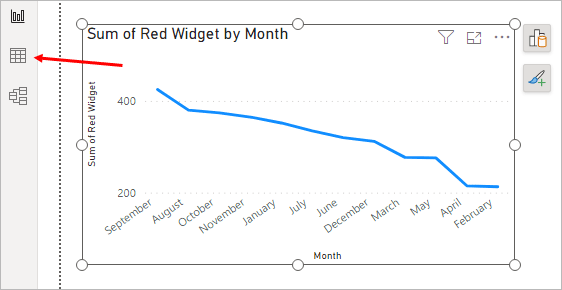
To do that, click the Data View icon top left of Power PI:
In Data view, select the Month column by clicking on the Month header. It will turn green:
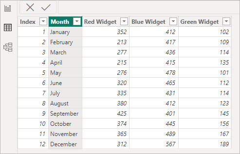
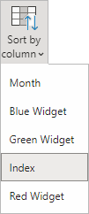
In the ribbon at the top of Power BI, change the Sort by Columns to Index:
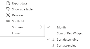
Go back to Report View and you'll see that your chart is still not sorted correctly. To remedy that, click the three tiny dots in the top right of your chart:
When you click the three dots, you'll see a menu appear. From the menu, select Sort axis > Month:
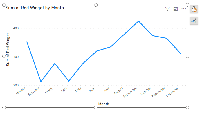
This will get you a chart with December on the left and January on the right. What we need is an ascending sort. So, go back to the menu above and select Sort axis > Sort ascending. Your chart will then be correct:
(If your chart is still not right, go back to Data View. Select the Index column. From the Sort by Column dropdown, make sure Index is selected.)
Now the chart gives us a better picture of what's happening for the year. The start of the year wasn't too great, as sales dropped off. However, they bounced back starting from April, climbing steadily before tailing off again. If we had further information, we'd want to know what we did right from April to September. Was it seasonal, or something else? A marketing campaign, for example. And why do sales of red Widgets fall from September to December? These are things that more data analysis could help solve.
Add more than one Line to a Power BI Chart
You can add more than one line to your Power BI charts quite easily.
Click the Build a Visual icon to see the flyout again. Click the
Add data button for the Y-Axis again. This time, add the
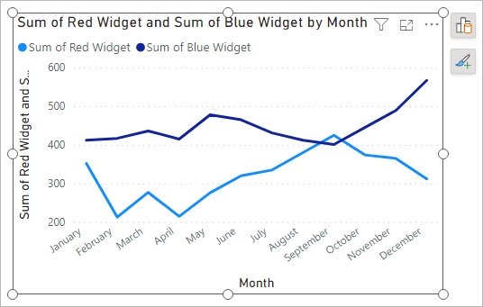
Blue Widget item:

A second line will be added to your chart:
Now add the Green Widget to the chart in the same way and your chart will look like this:

Although we have three lines on the chart, the chart itself looks a mess! We'll clean it up with some formatting. Let's start with the line colors, as they are all wrong for the widgets we sell. We'll do that in the next lesson below.
<--Back to the Power BI Contents Page