Home and Learn: Microsoft Excel Course
Format Pie Chart Segments in Excel
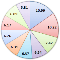
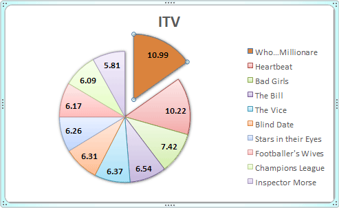
From the previous lesson, your Excel Pie Chart segements look something like this:
You can change the colour of each slice of your pie chart in Excel, and even move a slice. Let's change the colours first.
Change the Colour of a Pie Chart Segement
Left click on the pie chart itself to select it:

It is selected when you can see those round handles. Now left click on one of the segments to select just that individual slice. It's a little bit tricky, but if you do it right your pie chart should look like this:

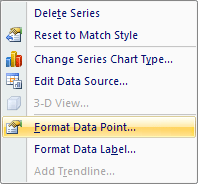
In the image above, only the 10.99 segment is selected. You should see round circles surrounding just that segment. Now right click your segment and, from the menu that appears, select Format Data Point:
Click the paint bucket icon at the top, then click to expand the Fill option. Select Solid fill, and select a colour from the dropdown list:

We've gone for a light orange colour, but select any colour you like.
Move a Pie Chart Segement in Excel
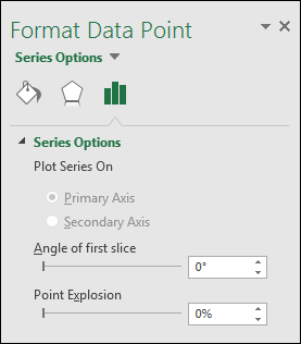
To move the slice that you've just coloured, click back on Series Options from the options on the left (the bars):

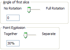
Set the Point Explosion slider to about 30%
Your chart should look something like this one:
Change the rest of the slices in exactly the same way. You can format the rest of the chart exactly like you did for the Bar chart. But it looks quite impressive as it is!
In the next part, we'll look at our third and final chart style - a 2D Line Chart
Create a 2D Line Chart in Excel -->
<--Back to the Excel Contents Page