Home and Learn: Microsoft Excel Course
Format an Excel Chart
In the previous lesson, you saw how to use the Chart Elements panels to change the layout of the chart itself. The Format panel, on the other hand, lets you create some great looking charts with just a few mouse clicks. Let's see how it works.
Format Chart
Click on your chart to select it, and then click the Format menu at the top of the Excel Ribbon. You should see this long menu, split in two here:
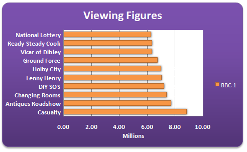
Using the various Format Panels on the Excel Ribbon, we'll format our chart from this:

To this:
OK, it may look a bit gaudy! But at least it's lively. You can create a chart like this quite easily:
- First, click on your chart to highlight it
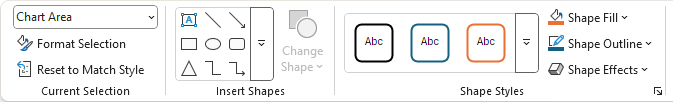
- Click the Format menu on the Excel Ribbon
- Locate the Shape Styles panel:
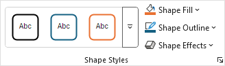
Click the down arrow on the right of the panel to see the available styles:
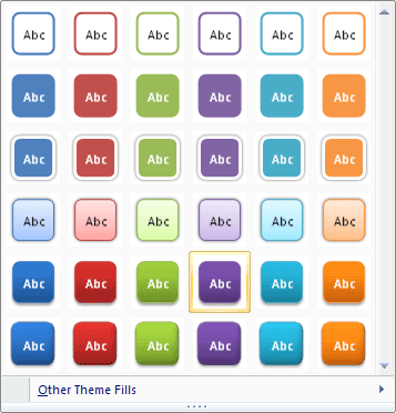
When you move your mouse over a style, your chart will change automatically. But you won't be able to see the full effect until you click away from the chart. We went for Style 28, the one that's highlighted in the image above. You get the rounded corners, the drop shadow and the colour fill.
Create your own Chart Style in Excel
You can create all that yourself, though. If you want to create your own style, try the following:
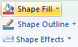
Fill your chart with a colour by clicking the down arrow on Shape Fill on the Shape Styles panel:
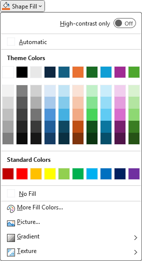
Still on the same menu, click on Gradient. The sub menu appears:

We went for one of the Dark Variations.
Next, you can spruce up the text on your chart. Locate the WordArt Styles panel:
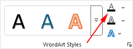
Click the first "A", indicated by the red arrow above, to see a list of available Text Fill colours:

Excel Chart Rounded Corners
Once you have the chart background and text formatted the way you want it, you can add some rounded corners, and a bit of drop shadow. You can apply both of those from the Format Chart Area dialogue box. Here's how.
To bring up the Format Chart Area dialogue box, click the Format Selection button on the Current Selection panel:

You should see a panel appear on the right of Excel. click the Border category to exapand it. The Rounded Corners options is at the bottom:

Put a tick in the box for Rounded Corners.
Excel Chart Shadows
To get a Shadow for your chart, click the Hexagon symbol at the top, just to the right of the paint bucket:
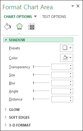
Click the Presets button to see a list of pre-made shadows:
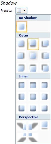
Select the one you like. Then click Close on the dialogue box. Your chart will then have rounded corners and a drop shadow.
OK, you should now a very smart chart. Playing around with the various options on the Format Chart Area dialogue box can really bring an Excel chart to life!
Next up, we'll have a go at pie charts:
Create a Pie Chart in Excel -->
<--Back to the Excel Contents Page