Home and Learn: Microsoft Excel Course
Excel Chart Layout Panels
In the previous part of this lesson on charts, you saw how to format a chart with various dialogue boxes.
You can also format your charts using the menu items on the Excel Ribbon bar, at the top of the screen. With your chart selected, click the locate the Chart Layouts menu on the far left, just under the File menu:

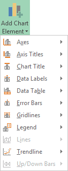
Click Add Chart Element to see the following drop down list:
The first thing you may want to do is to give your chart a name. Locate the Name box just below Chart Layouts:
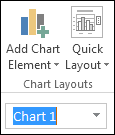
Highlight the default Chart 1. Type a new name (BBC 1) and press enter:
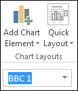
Chart Elements in Excel
The Add Chart Elements dropdown on the Chart Layouts panel lets you format elements on your chart. Here it is:
As you can see, you can format Axes, Axis Titles, Chart Titles, and a whole lot more. Let's run through a few.
Formatting Chart Titles in Excel
Excel let's you format your Chart Title. Click on Add Chart Elements again.
Click Chart Title see a submenu:

You can select to have no chart title, a title above the chart, or a centered overlay. Click each one in turn to see what they do.
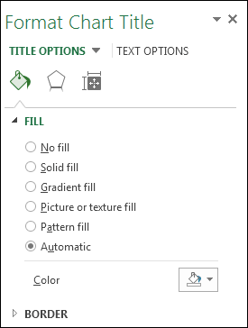
Once you're happy with the postion of your chart title, select the option at the bottom of the submenu, More Title Options. You'll see a panel appear on the right of the screen. This one:
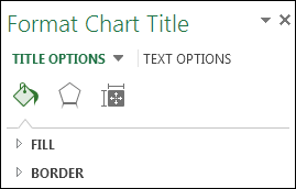
Click an arrow to see further options. Here are the options for Fill:
You can also click the icons at the top. There are three of them: a paint bucket, an Hexagon, and a resize symbol.
Click the Hexagon and you'll see these options:

Click the Rezise symbol and the options will change to these:

As well as the three symbols, you can click the Text Options, just to the right of Title Options at the top. You'll then see even more options, this time to change the text itself:

Play around with all and see how they work.
Change the Axis Title in Excel
The second item on the Add Chart Elements menu is the Axis Title. Click the arrow to see the options:
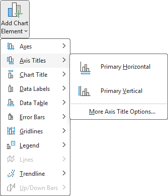
You can elect to have a title at the bottom of your chart (Primary Horizontal) and the left side of the chart (Primary Vertical).
At the moment, our chart has no Axis Title. It just has numbers running across the bottom. Someone looking at the chart won't know what the numbers represent. Here's what our Chart looks like at the moment:

Select Primary Horizontal on the Axis Titles menu of Add Chart Elements. A new title will be added to the chart:
![]()
Highlight the default text, and type your own:
![]()
Click away from the chart to see what it looks like:
![]()
We now have some explanation for what the numbers represent. You can add a Vertical Axis, as well. Click on Primary Vertical Axis Title and see how it works.
Chart Legend
The Chart's Legend is this one:
![]()
At the moment, our Legend is on the right of the chart. But you can move this. Click the Legend item on the Layout panel to see the various options:
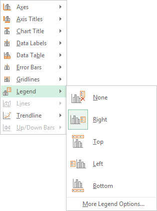
Click an option on the menu and watch what happens to your Legend. You should see it move around your chart.
Adding Data Labels to an Excel Chart
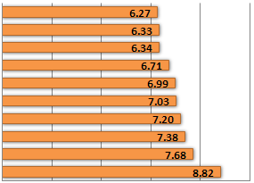
A Data Label is information overlaid on the chart bars. In our chart below, we have numbers overlaid on the orange bars:
You can format these Data Labels. Click the Data Labels item on the Add Chart Elements menu to see the following options:

The one that we have at the moment is Inside Edge. Click on Outside End and your Data Labels will look like this:

You can also see more options if you click More Data Label Options from the menu. You'll then see the Format Data Labels panel appear on the right of your screen. Again, play around with the options to see what they do.
In the next part, we'll take a look at the Format Chart panels in Excel. You can create some impresive looking charts very quickly on this panel!
Format Chart Panels in Excel -->
<--Back to the Excel Contents Page