Home and Learn: Microsoft Excel Course
How to Create a Pie Chart in Excel
Pie charts are quite easy to create in Excel. In case you're not sure what a Pie Chart is, here's the basic one you'll be creating. Later, you'll add some formatting to this:

To make a start, you need to highlight some data. If you've been following along with the previous tutorials, then you'll have some viewing figures data. You've created a 2D chart with the BBC data. This time we'll use the ITV data. If you don't have this data, create the following simple spreadsheet. The cells to use are D4 to E14:

- Click inside cell E4 and change "Millions" to ITV, if you already have the data from a previous lesson
- Highlight the cells D4 to E14
- Click the Insert menu at the top of Excel
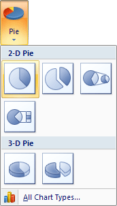
- Locate the Charts panel, and the Pie item: (The Pie chart is hard to spot. But it's highlighted in green in the image below.)

Click the down arrow and select the first Pie chart:

- A new Pie chart is inserted
- Move your new pie chart by dragging it to a new location
- You should have something like this:

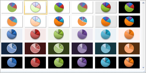
To get different styles, make sure that your chart is selected and locate the Chart Style panel:

Click the down arrow to the right of the Chart Style panel to reveal the available styles (you may not see all the styles below):
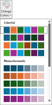
If you want different colors for your pie chart segments, click the Change Colors drop down:
Your chart may then look like this (your labels may well be at the bottom, though, depending on which version of Excel you have):
But it looks pretty good for just a few mouse clicks! We can still do a bit more to it, though. In the next part, you'll see how to add the viewing figures to the pie chart segments.
Add Data Labels to a Pie Chart in Excel -->
<--Back to the Excel Contents Page