Home and Learn: Microsoft Excel Course
Add Data Labels to an Excel Pie Chart
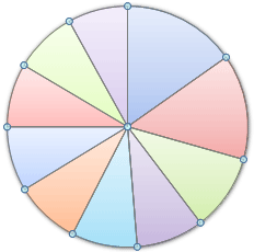
In the previous tutorial, you created an Excel Pie Chart that looks something like this:

At the moment, though, there's no information about what each segment represents. We're going to add the numbers from our ITV viewing figures. These ones:

To add the numbers from our E column (the viewing figures), left click on the pie chart itself to select it. You want to highlight just the segements:
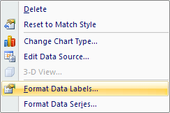
The chart is selected when you can see all those blue circles surrounding it. Now right click the chart. You should get the following menu:

From the menu, select Add Data Labels. New data labels will then appear on your chart:
The values are the same as in the data, from the ITV column. You can change this to percentages, if you prefer. To change it, right click your chart again. From the menu, select Format Data Labels:
You should see a panel appear on the right:
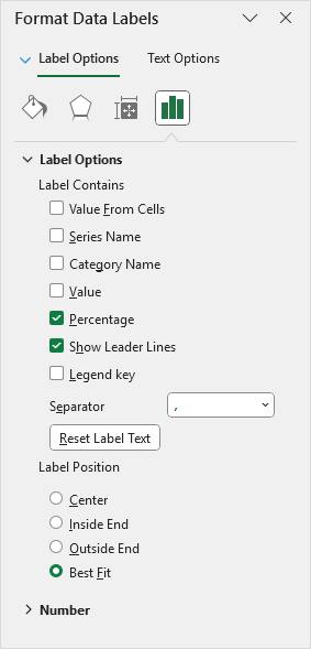
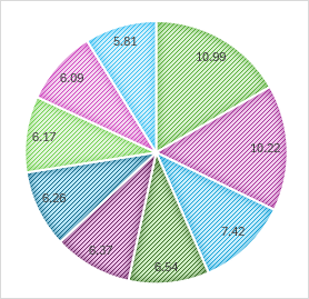
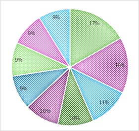
Uncheck Value and select Percentage instead, as in the image above. Your Excel Pie Chart may then look something like this:
Overall, the chart looks OK. But we can add some formatting to it. In the next part, you'll see how to format each individual segement of the Pie Chart. We'll change the colour of one segement, and separate it.
Format Pie Chart Segements in Excel -->
<--Back to the Excel Contents Page