Home and Learn: Microsoft Excel Course
Create a 2D Line Chart in Excel
For this last chart, we'll compare the viewing figures of BBC1 and ITV. A line chart is better for this type of data. The chart we'll create looks like this:
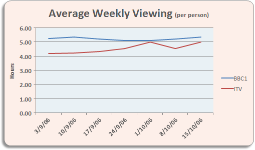
We're comparing how many hours per week a person watches BBC1 with how many hours they watch ITV. You'll need some data, of course. Start a new spreadsheet and enter the same data as below:

Once you have your spreadsheet data, highlight the cells A3 to H5. Now click Insert from the Ribbon bar in Excel. Locate the Charts panel, and click on Recommended Charts.

You'll then see a dialogue box appear. Click on All Charts:

Select the Line item from the list on the left. At the top, you'll then see a few different line charts you can choose from. In the image above, the first line chart is selected (in grey). Click on the others to see what they look like. If you select the first one, as we have, your chart will then look something like this:

The chart looks a bit plain, at the moment. You can change the colour of the lines for BBC and ITV. Locate the Chart Styles panel on the Chart Design ribbon:
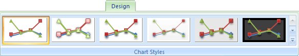
Click the down arrow on the right of the Chart Styles panel to reveal the available styles:

We've gone for the first one, top left. When you select a style, your chart will change:

The lines are more distinct now. The dates at the bottom don't look too impressive, though! In the next part, you'll see how to format the dates on the bottom Axis.
<--Back to the Excel Contents Page