Home and Learn: Microsoft Excel Course
Format a Chart Axis Title
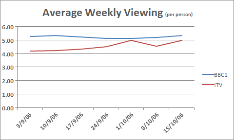
From the previous lesson, your 2D Excel Line Chart should look something like this:

To format the dates on the bottom Axis, click on them with your left mouse button. With the dates Axis selected, right click. You should see this menu:

Select Format Axis from the menu, and you'll see a panel appear on the right of the screen:

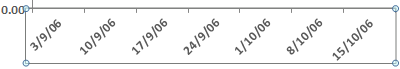
Under Axis Options, the first item, Automatically select based on data is the default. Change this to Text Axis. Your dates should end up in the middle:

To add an Axis label at the top of your chart, stay on the Design Ribbon and locate the Chart Layouts panel on the left, just under the File menu. Click Add Chart Element, then Chart Title > Above Chart:

You will then see a default title appear at the top of the chart. Highlight the text, and type a title of your own:
Add a Left Axis
We now need to add an Axis for the numbers running up the left of the chart. The numbers are the hours per week that people watch each channel - 0 to 6.
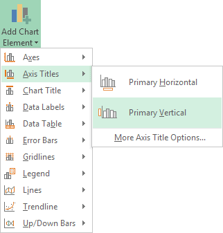
From the Add Chart Elements menu still, select Axis Titles > Primary Vertical:
This will add a title like the following one:

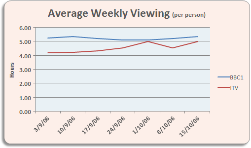
Highlight the default title and type Hours. You can move the title to the left by clicking and dragging. This is a little tricky, though! Use the Zoom tool at the bottom of Excel to zoom in on your target:


When you're done, your chart should now look like this one:

Or this:

You can format your line chart to smarten it up a bit: adding a fill colour, rounded edges, shadow, etc. You've already done this previously, so we won't go through it again. When you're done, it may look like ours:
And that's it for line charts. If you've been following along from the beginning, you should now have some impressive Excel chart skills.
In the next part, we'll take a look at how to predict future values with Excel charts.
Predicting future values with an Excel Chart -->
<--Back to the Excel Contents Page