Home and Learn: Android Course
The Android CardView
In Android, a CardView is a special container that allows you to have a kind of popup screen with rounded corners and drop shadows to create the illusion of depth. In this lesson, we'll create a popup card when a button is tapped. The card will have an image and some text underneath it.
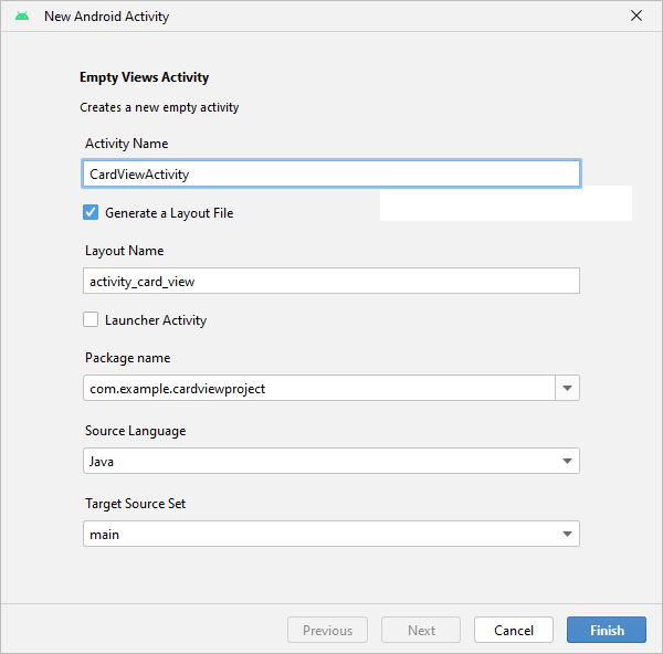
Create a new Empty Views Activity project for this (File > New > New Project). If you're not sure how to create a project, see this previous lesson. Give your new project any name you like, but we've called ours Card View Project. Make sure that Java is the selected language and click Finish. (If you get errors when your project is created, see this page in a previous leson.)
When your project loads in Android Studio, select the default TextView in the Component Tree to the left. Press the delete key on your keyboard to get rid of the TextView.
In the Palette, locate the Button widget (In the Common category and also in the Buttons category.) Drag a new button onto your app, somewhere in the middle. Then click the wand in the toolbar, as indicated in the image below:

But don't worry if your button doesn't look exactly like the one above - we're only using it to launch a Card View. You can add some text to the buton, though, just like you did in previous lessons. Add the text Show Card View.
Add the Java Code
To add the code that will launch the Card View, open up the MainActivity.java file in the Androdi Studio editor, if it's not already open. (If not, it's in the app > java > com folder.) Add the following method below your onCreate method:
public void showCardOne(View view) {
}
You may get red text for View. If so, click anywhere inside of the View text. Press ALT + ENTER on your keyboard to add an import line to the top of your code. If that doesn't work, copy and paste this
import android.view.View;
We're going to start another activity, just like in the last lesson, so we need an Intent. Add this line to your new method:
Intent cardIntent = new Intent(this, CardViewActivity.class);
You might get redlined for Intent and CardViewActivity. Click your mouse inside the Intent text. Press ALT + ENTER and your keyboard to add the import line to the top of your code. Again, we did all this in a previous lesson. But if the keyboard option doesn't work for you, add import android.content.Intent; to the top of the code, with all the other import lines.
The only other line we need is one that starts an activity. Add this below the Intent line:
startActivity(cardIntent);
The red highlighted text for CardViewActivity is because CardViewActivity is a class that we haven't created yet. But your code should look like this:

The button we created will execute our new method and launch the Card. But you need to tell Android which method you want.
Go back to the activity_main.xml file. Make sure your button is selected. In the Attributes area on the right of Android Studio, locate the onClick event. From the dropdown list, select the showCardOne method:

We can now create that CardViewActivity class and its XML file. Just like you did in the previous lesson, right click the java folder in the project area on the left. Select New > Activity > Empty Views Activity from the menu that appears. In the New Android Activity dialog box, type CardViewActivity as the Activity Name. Make sure that Java is the Source Language and that Target Source Set says main:
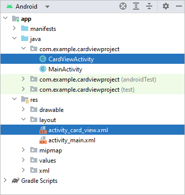
Click Finish. You should have a new Java file in your project area, along with an XML file in your res > layout folder called activity_card_view.xml:
Now let's design the layout for our new activity.
Card View Layout Design
Double-click the activity_card_view.xml to open it up. Make sure you're in Design view and not Code view. In the Containers section of the Palette, locate the CardView item:

Drag one onto your white canvas in the middle. Click the wand in the toolbar to add constraints:
A CardView is a container that holds other views, like images and text boxes. You typically place these images in Linear Layouts. To see what this means, drag a vertical Linear Layout from the Layout section of the Palette onto the CardView in the Component Tree:

Now let's get an image for the ImageView. Right-click the following image and save it to your computer:

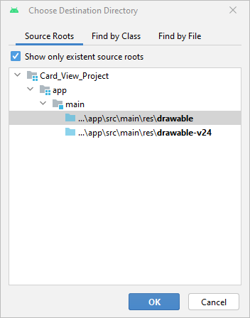
If you're on Windows, hold down the Windows key on your keyboard. Keep it held down and press the letter e on your keyboard. This will open up an Windows File Explorer window. (If this doesn't work, type File Explorer in the windows search box.) Navigate to where on your computer you saved the above image. Press CTRL + C to copy the image. In Android Studio, click on your res > drawable folder in the project explorer on the left. Press CTRL + V to paste your image over. You should see this dialog box appear:
Click OK to see another dialog box. This one:

Click OK and the image should appear in your drawable folder:

Back in your Palette, click on the Common category (or the Widgets one) and locate the ImageView. Drag an ImageView onto your Layout in the Component Tree:

As soon as you let go of your left mouse button, you'll see the Resources dialog box appear:
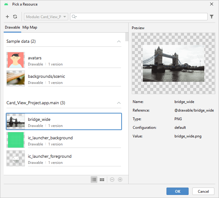
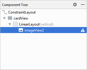
The image you pasted over to the drawable folder should be on the list. Click to select it and click OK. You should then see the image appear on your white canvas. Your Component Tree should look like this: (Don't worry about the warnings. And your ImageView probably won't have a 2 on the end.)
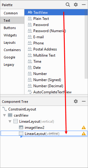
We can add another Vertical Linear Layout to hold the text boxes.
Drag a second Vertical Linear Layout onto your Component Tree. Drag it just below the Image View. In the Palette, click on the Text category (or the Common one). Drag a TextView onto your second Linear Layout:
Repeat the process and drag a second Text View just below the first one. Your Component Tree will then look like this:

Your layout itself will then look like this:

Click on your first TextView to select it. As the text, add London Bridge. You can add the text as a string resource, just like you did in a previous lesson.
Click on the second TextView to select it. Copy and paste the following text as a string resource:
This is Tower Bridge in London. A lot of people get it confused with London Bridge, which is not one bridge but refers to different bridges that have spanned the river Thames between the City of London and Southwark (pronounced SU-thark). The old London bridge that stood for over 600 years was pulled down in the 19th century and replaced with a much more modern one designed by John Rennie. This bridge was then sold to Robert McCulloch, who had it shipped to Arizona where it still stands.
You can format the text to your liking. Try the textSize and textStyle attributes, under the Common Attributes section.
If you want some space between each view, click a widget to select it. In the Attributes area on the right of Android Studio, locate and expand layoutMargin, which is under the All Attributes category. You can set the layout_marginBottom to a value like 12dp for the ImageView. Your layout should look something like this:

Now let's play around with the CardView itself. We'll do that in the next lesson below.
< Andriod Bundles | CardView Settings >
Back to the Android Contents Page