Home and Learn: Android Course
Android Card View Layout
In the previous lesson, we set up a layout with a CardView. We added an ImageView and two TextViews to the layout. In this lesson, we'll do something with the CardView itself.
Select your CardView in the Component Tree. You can see that there's too much space at the top in ours:

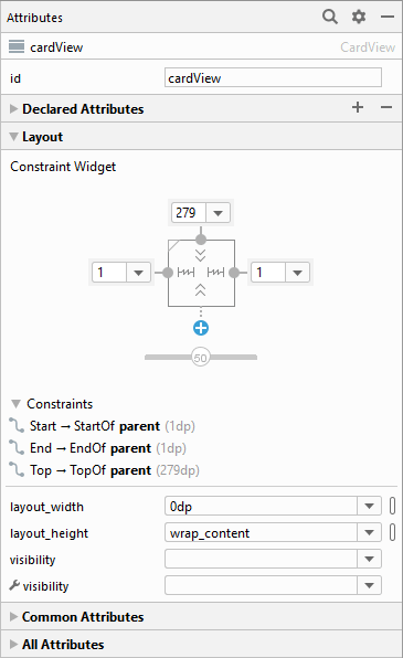
In the Attributes area on the right, expand the Layout section. The top constraint is 279:
You can change this to something smaller. Also, change the left and right constraints to something other than 1. In the image below, we've gone for 24:

Shortly, we'll expand the Common Attributes section and play around with these values. For now, you can try it out. Run your app. Click your Show CardView button. You should see this in the emulator:
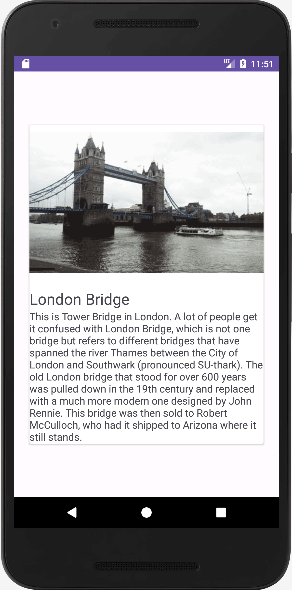
It looks a bit bland, though.
Now stop the app from running. With your CardView selected, go back to those Common Attributes we've just mentioned. Play round with the cardBackgroundColor, the cardCornerRadius, and the cardElevation, as well as the font settings for the two text views. (Careful when selecting a color for the card, though. If you choose one of the inbuilt colors, it may crash your app!) But here's ours with a few of the settings changed:
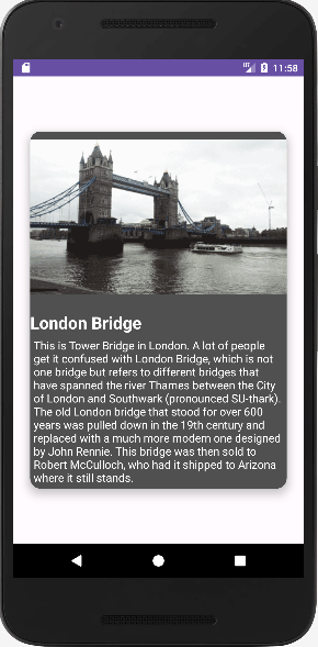
The indents for the text were done by selecting the TextView in the Component Tree and adjust the layout_margin attributes.
But that's it for CardView. They come in useful when you want to display information. You can add other controls to them, like buttons, for example. The buttons could take you to a website for more information.
We'll move on, though, and take a closer look at the various widgets you can add to a layout.
< CardView Design | Android Button Styles >
Back to the Android Contents Page