Home and Learn: Power BI 2023
Power BI Image Slicer
In a previous lesson, you added a slicer to your dashboard. It looked like this:
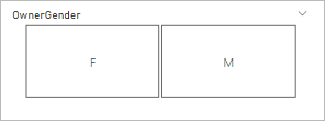
You click on a slicer 'button' and the rest of your dashboard visuals will update.
But these buttons look a bit bland. Wouldn't it be better if you could have an image as a slicer, instead of boring white rectangle? Well, you can! In this lesson, you'll see how to use an image as a slicer.
First, you'll need the Pets dataset. Download it here, if you haven't already:
Pets Data (Right click > Save As)
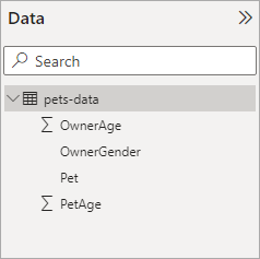
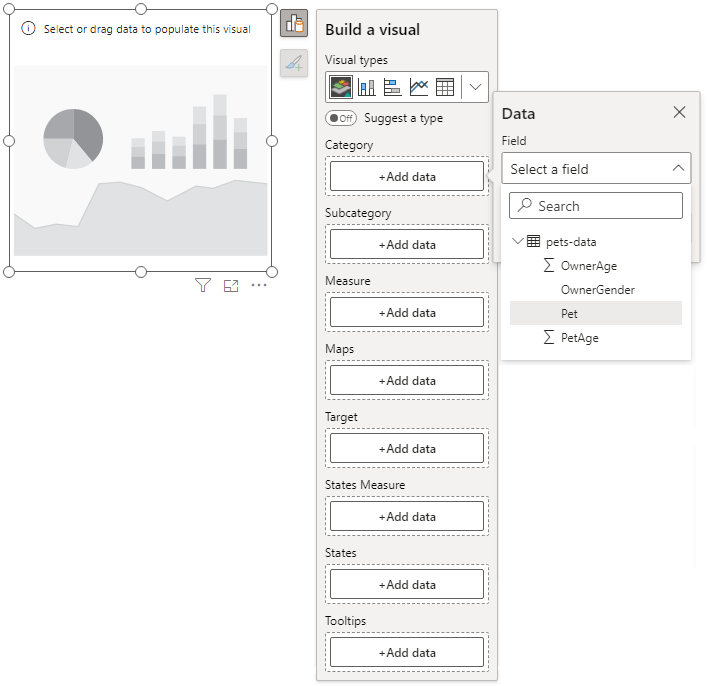
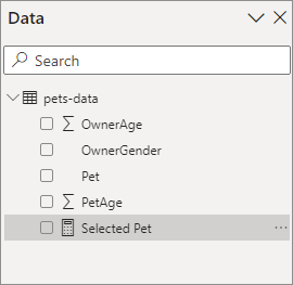
Launch your Power Bi software. Click the Get Data link and load the pets CSV file from above. The right side of Power BI will then look like this:
Install Synoptic Panel
OK, we have our data. Now we need an image that we can turn into a slicer. For this to work, we'll need to install a plugin called Synoptic Panel. This is quite easy.
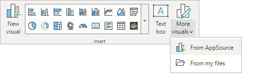
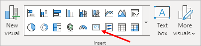
From the Home ribbon at the top of Power BI, locate the Insert panel. To the right of the Insert menu, there is an icon for More Visuals. Click this and then select From AppSource:
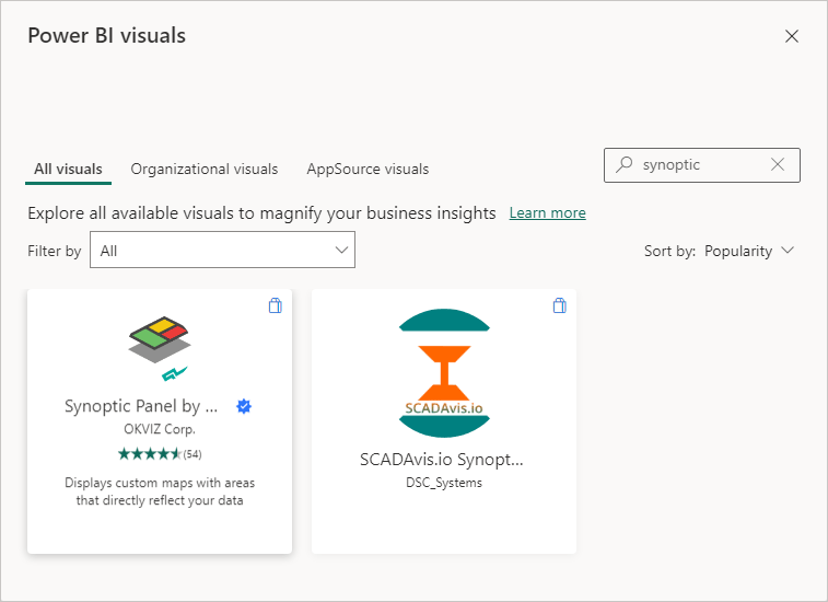
When you click on From AppSource, you might get an email box popping up asking you to login. If you haven't already, sign up for the free Power BI account. You'll then be able to publish your dashboards for the world to see. As well as publishing your dashboards, you'll be able to download and install plugins. Eventually, you'll see a Power BI Visuals screen (it's a bit big for a screenshot on these pages). In the search box top right of the Power BI Visuals screen, enter Synoptic:
Click the Synoptic Panel item. On the next page, click the Add button. The plugin is free. So, when you click the Add button, Power BI will install your plugin. You'll then see it on the Insert panel, indicated by the red arrow, in the image below:
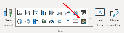
Don't click the item yet because we're not done setting up.
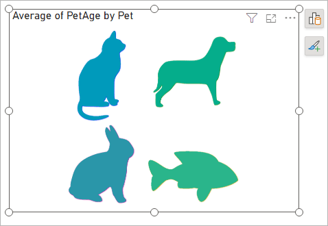
What you need now is an image to use as a slicer. As we're using our Pet Data again, we have an image of some pets we'd like to use. This image:

Right-click the image above and select Save Image As from the menu. Save the image to your own computer.
Now take a look at the Pets CSV file we're using as the data source:
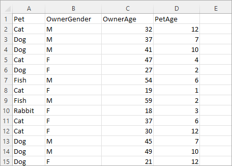
Notice the Pet column, which is column A in the image above. You're going to need the values in this column: Cat, Dog, Rabbit, Fish. And take note of the spelling.
OK, we have the image, we have a column of categorical data. Now what?
Well, head on over to the following web site:
https://synoptic.design/ (link opens in new tab)
Drag and drop the pets image you've just downloaded onto the panel that says Drag an Image Here:
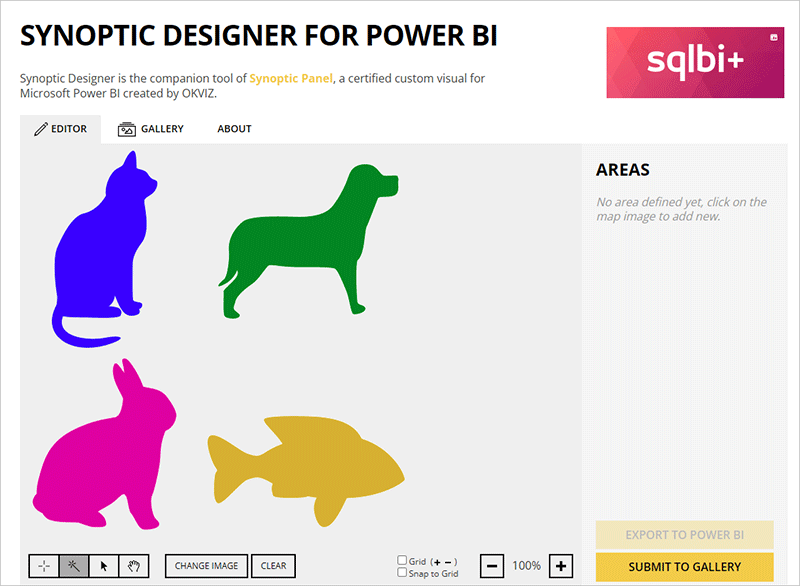
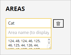
Make sure the wand tool is selected bottom left. Now click on the Cat. An area will appear on the right of the screen:
What you are doing here is creating areas on your image that are going to be clickable. There is a 1 in the Area box, at the moment. You need to change this to one of those values from the Pet Column (Column A). Because you selected the Cat image, obviously change the 1 into Cat:
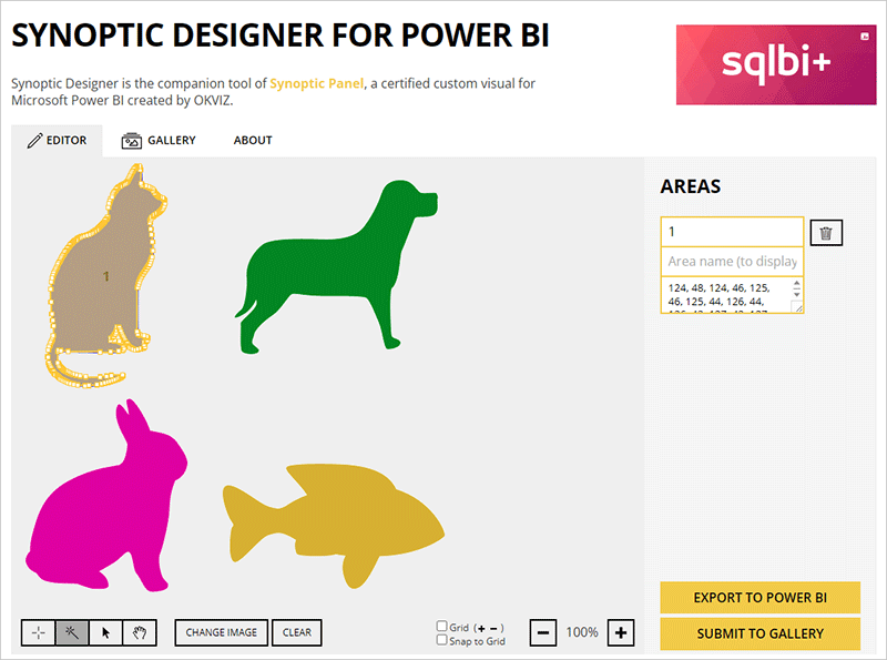
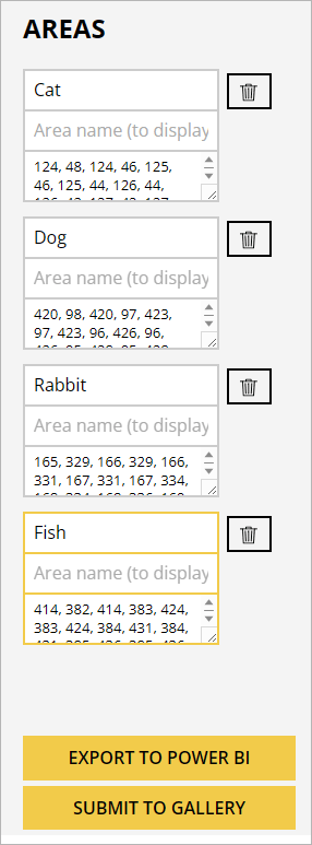
Now do the same with the other images - select a pet, type the pet name into the Area box. You'll then have this on the right:
Now click the button at the bottom that says, Export to Power BI. You'll then see this screen:
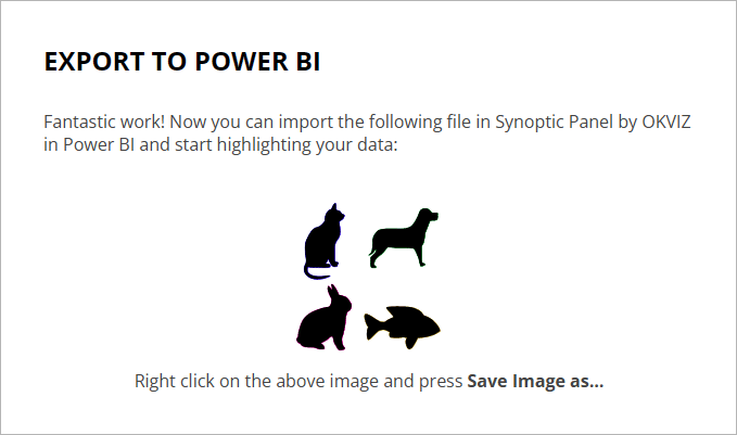
Do what it says at the bottom - right click your image and select Save Image As from the menu that appears. You'll see a standard Save As dialog box. The default name will say download.svg. Change this to animals.svg. Click Save and remember where on your computer you saved the SVG file to. (SVG is short for Scalable Vector Graphics.)
OK, we're done with the setting up - we now have an image with clickable areas.
Synoptic Panel Visual
Back in Power BI, click the icon on the Insert menu for Synoptic Panel:
You'll see a default visual appear on your dashboard:
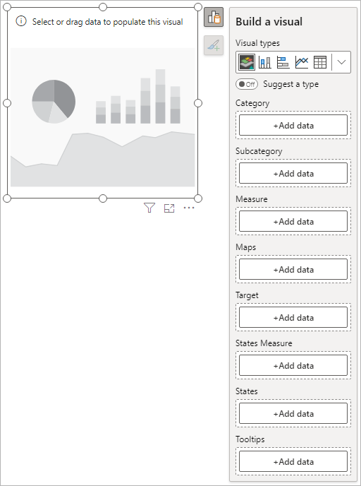
Although the Build a Visual panel is a bit long, we only need two items, Category and Measure. The Category one is for those values from the Pet column: Cat, Dog, Rabbit, Fish. The Measure item is for what you want to display - Sum, Average, Count, etc.
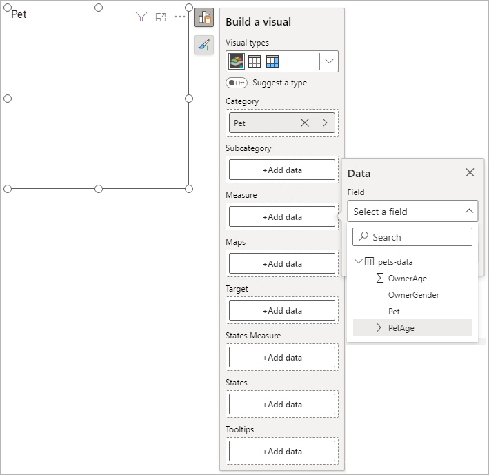
Click the Add Data button under the Category item. Select the Pet item:
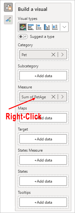
Click the Add Data button under the Measure item. Select the PetAge item:
By default, the value for the measure will be a Sum. Change this to Average by right-clicking where it says, Sum of Pet Age:
The Synoptic Panel visual should look like this:
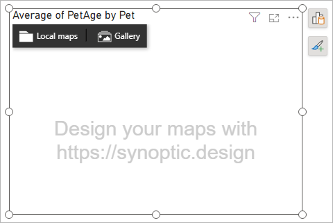
Click the Local Maps item on the menu at the top of Synoptic Panel. This will launch a dialog box where you can select the image you want to use. Navigate to where on your computer you downloaded the animals.svg file. The Synoptic Panel visual will then load your pets image:
The slicer is now set up. But we haven't got anything to slice.
Add a Power BI Card Visual
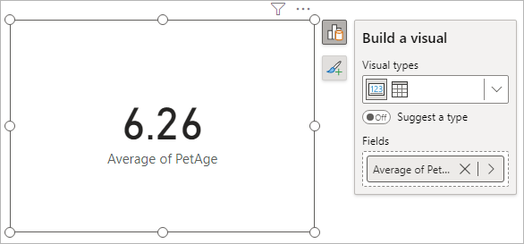
Click anywhere on your dashboard that isn't the Synoptic Panel visual. Now Insert a Card visual:
From the Build a Visual panel, click the Add Data button. Add the PetAge item. Again, it will default to Sum of PetAge. Just like you've already done, change this to Average. Your card will look like this:
Now for the magic.
Click any of the pets in the Pet Image. The card will update to show you the average age of the pet you selected. Here's the card with the Rabbit image selected:
Except, wouldn't it be nice if we could add the actual pet selected to the card visual? Then the card would say, Average Age of Rabbit instead of the generic Average of PetAge, as it does above. To do that, we're going to need a DAX measure.
Add a Power BI DAX Measure
We covered simple DAX measures in a previous lesson. This one is pretty simple too. We only need to join some text with the selected value from the Pet column of our table.
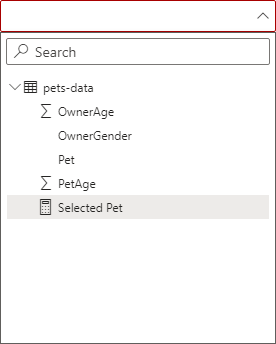
Create a new DAX measure by right-clicking the pets-data table name in the Data area on the right of Power BI. From the menu, select New Measure:
In the formula bar at the top of Power BI, enter the following:
Selected Pet = "Average Age of: " & SELECTEDVALUE('pets-data'[Pet])
![]()
First ,we have a name for our measure, Selected Pet. After and equal sign, we have some direct text. This is surrounded by double quotes. Then we have an ampersand (&). The ampersand is used to join direct text with a DAX function.
The DAX function we need is called SELECTEDVALUE. In between the round brackets of SELECTEDVALUE, you first need a table name, which is pets-data for us. (Note that the table name is surrounded by single quotes.) In between square brackets, type the name of a column from that table. Our column is the Pet column.
The syntax, then, is this:
MEASURE_NAME = "SOME_TEXT_HERE" & SELECTEDVALUE( 'table_name'[column_name] )
Once you've done entering the DAX code, hit the Enter key on your keyboard, or click the tick to the left of the formula bar. You should see the measure appear in the Data area of Power BI:
We now need to add this measure as the title for the card.
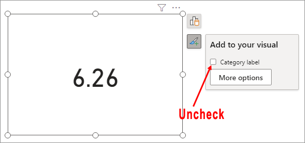
Make sure you card is selected. Bring up the formatting panel and uncheck the Category label item:
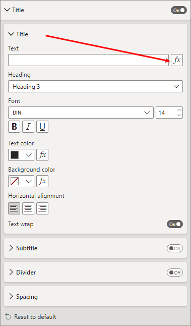
Click the More options button. In the Format panel on the right of Power BI, toggle the Title item to ON. Then expand the Title section. Click the little FX button:
Clicking the FX button will bring up this dialog box:
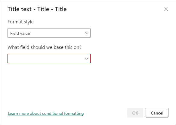
The Format Style dropdown is OK on Field Value. Click the dropdown for What field should we base this on?
From the list, select the DAX measure you created, Selected Pet.
Click OK on your dialog box.
While you have the Title format area open, you can center the title and increase the font size.
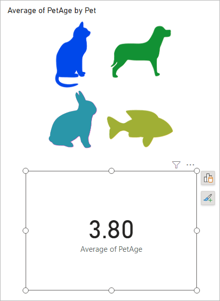
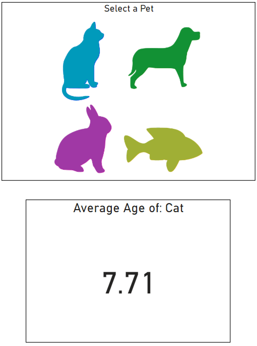
Select a pet from your pet images. The card will now display which pet you selected. In the image below, the Cat image has been selected (we've applied some formatting to the Synoptic Panel):
And now here's the same dashboard with the Dog image selected:
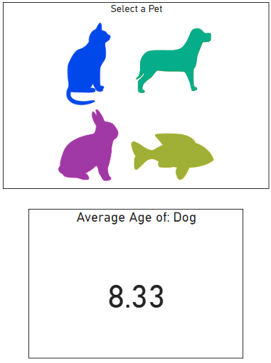
In each case, the card was updated with the name of the pet that was selected from the image. A great addition to an image slicer!
In the next lesson below, you'll learn how to add a Key Performance Indicator - the KPI.
<--Back to the Power BI Contents Page