Home and Learn: Power BI 2023
Power BI Chart Types
You've already added and formatted a line chart in a previous lesson. In this lesson, we'll explore some of the other chart types available with Power BI.
We'll use a very simple dataset for this lesson, which is just an Excel spreadsheet. Download it here:
The data is just some basics stats for a role playing game. It's this:

Not exactly the greatest dataset ever, but it will work well with the chart types in this section.
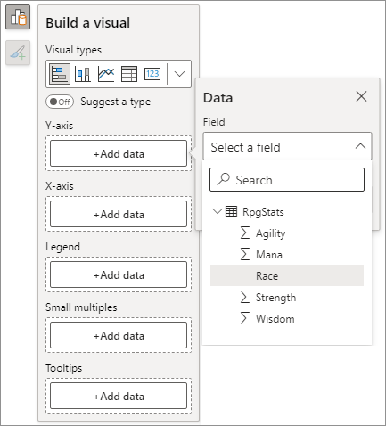
Just like you did in previous lessons, load the Excel file into Power BI. In the Data pane on the right, you should see the columns from the spreadsheet:

(If you can't see a Data pane, click the View ribbon at the top of Power Bi. From the View ribbon, toggle the Data item on the Show Panes panel.)
From the Power Bi Home ribbon, select the first chart type on the Insert panel. The first chart type is the Stacked Bar chart:
![]()
You should see an empty visual appear with the Build a Visual panel expanded:
Click the Add Data button under Y-axis heading. Select the Race column:
Click the Add data for the X-axis and add column for Agility. Your chart will look like this:
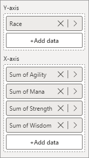
Now add the Mana, Strength, and Wisdom columns to the X-axis:
And here's the chart now:

That's not a terribly useful chart as it's difficult to see what's going on. Let's change the chart type. For the information here, a chart type called a 100% Stacked Column chart might be a better fit.
To change to a new chart type, make sure your current chart is selected. From the Home ribbon at the top of Power Bi, locate the Insert panel. Now click the arrow to see the dropdown list of visuals:

Click the icon for 100% Stacked Column, indicated by the red arrow in the image above.
Your chart will turn into this, once you've spruced it up a bit (you learned how to format charts in a previous lesson):

This is much easier to read. But it's a little misleading. Just by looking at the chart, you'd think that the Goblin has the same amount of Agility as the Elf. Also, is this a super goblin who has lots of strength compared to the other two races?
The answer is no. And that's because the 100% Stacked Column chart is not a good fit if you want to compare columns. Switch the Data Labels on (via the Add to your Visual panel, which is the little paintbrush icon top right of the chart). You'll see percentages added to the chart:
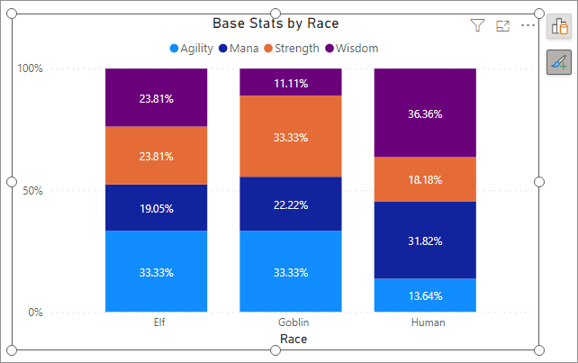
We can see that the Goblin has 33.33% of its stats in Agility and Strength, while only 11% of its stats are in Wisdom. Meanwhile, the Human has 36.36% of its stats in Wisdom and only 18.18% in Strength (clearly going for a Mage build!).
But this doesn't tell us the raw numbers. We'll need another chart type for that.
Clustered Column Charts
With your chart still selected, click the Clustered Column chart type on the Insert panel:
![]()
Your chart will turn into this:
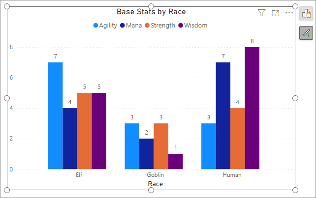
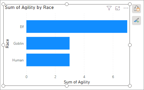
That's a lot better, if you want to see raw numbers and compare columns at the same time. Now we can see that the Human has 8 in Wisdom, compared to the Goblins measly 1 point. Also, the Elf is much more Agile than the other two.
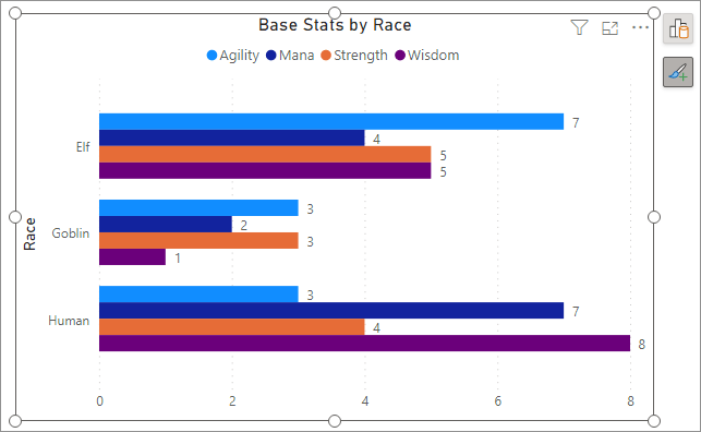
Now try the clustered bar chart. It will look like this:
Try the other chart types. You'll see that they are not good fits for the data.
Power BI Pie Charts
Let's see the pie chart in action. We want to compare each race's Mana.
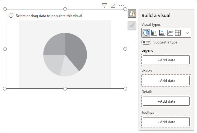
Make sure nothing is selected in your dashboard (click on a white area to deselect everything). From the Insert panel, select the Pie chart icon:
![]()
The empty visual will look like this:
From the Build a Visual panel, click the Add Data button under the Legend heading. From the Data panel that appears, select the Race column. You should then see Race under Legend:

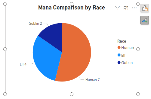
Click the Add Data button under the Values heading. From the Data panel that appears, select the Mana item. You'll then have a basic pie chart:
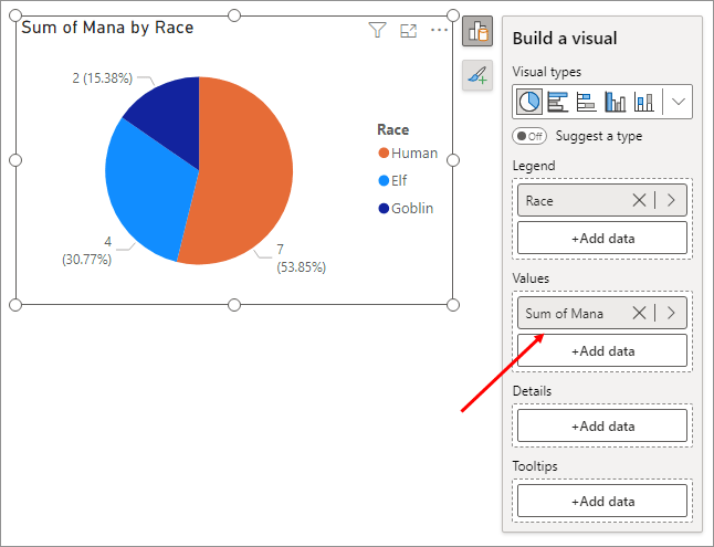
We can see that the biggest share of the Mana pie belongs to the Human. The smallest piece of the pie is for the Goblin. The default for the values themselves is numbers and a pie percentage. Let's play around with pie formatting.
Pie Chart Formatting
Click the little paintbrush in the upper right corner of the chart. You'll see the Add to your visual panel appear:
There are three items on the panel, all selected: Title, Legend, and Detail Labels. It's pretty obvious what they are, but check and uncheck the boxes to see the results.
But click the More Options button. This will bring up the Formatting panel on the right of Power BI.
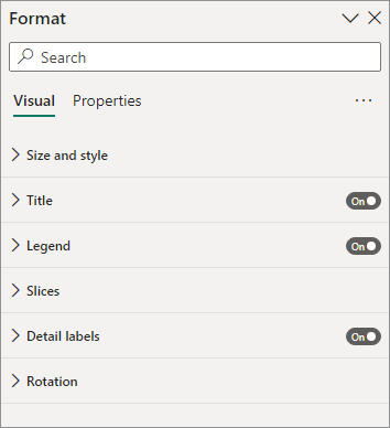
The main formatting categories are Size and style, Title, Legend, Slices, Detail labels, and Rotation.
Expand the Title one first. This was just like the Title we changed when we did a line chart. Expand the Title option and type a new one:
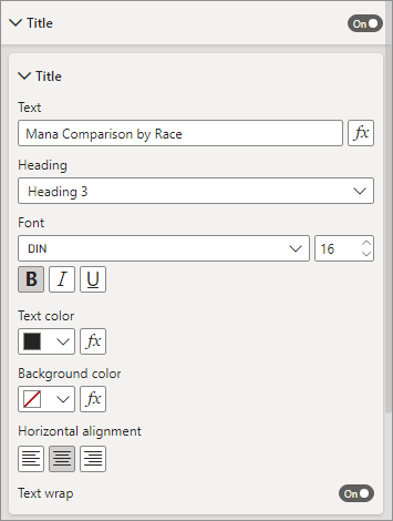
We've changed the Title to Mana Comparison by Race. We've also elected to center the Horizontal Alignment.
Now expand the Detail labels section:
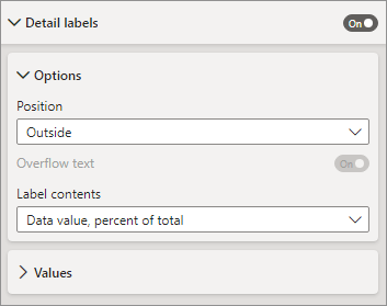
There are only two subsections under the Details labels section, Options and Values. The values on your pie chart are Outside the pie, by default. Change this from the Position dropdown. There are only four options: Outside, Inside, Prefer Outside, Prefer Inside. Play around with these options.
Expand the Label Contents section, though. The default, as we have seen, is for the value to be displayed as numbers and percentage. Click the dropdown list to see the following alternatives:
Category
Data Value
Percent of Total
Category, Data Value
Category, Percent of Total
Data Value, Percent of Total
All detail labels
Again, play around with the different values to see what they do. Here's
our chart with the Category, Data Value option selected:
A lot of people hate pie charts and see them as unnecessary and cliched. But they can convey a lot of information in one quick visual.
Power BI Donut Charts
With your pie chart selected, click the icon for the donut chart on the Home > Insert panel:
![]()
When you select the icon, your chart will update to this:

The donut chart has the same formatting options as the pie chart, as they are basically the same thing.
The Power BI Treemap
With your donut chart still selected, click the icon for the Treemap, which is just to the right of the donut chart on the Insert panel:
![]()
You should your chart update to this:
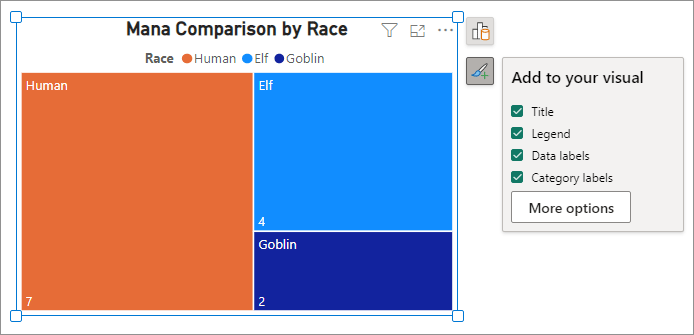
Just like the pie chart and the donut chart, a treemap is another chart you can use to compare data values. The Add to your visual panel will show one more option, by default - Category labels. Check and uncheck this option to see what it does.
A good chart can really liven up your dashboards. And, of course, they are interactive. Selecting a slice of a pie chart, for example, will cause any other data visuals you have to update. In the next lesson, you'll learn how to clean your data before loading it into Power BI.
<--Back to the Power BI Contents Page