Home and Learn: Power BI 2023
Add a Chart Visual in Power BI
In the previous two lessons, you opened a CSV dataset and created a Table visual from the data. In this lesson, you'll learn how to add a chart to your dashboard.
Power BI 2023 Charts
Click anywhere in a white area on your dashboard. This will deselect the current visual. If you don't deselect a visual then, when you try to add a new one, it will just replace the selected visual. In other words, if you have the table selected and try to insert a chart, the chart will replace the table.
So, insert a new chart visual. Select the Clustered Column Chart
from the Insert grid at the top of Power BI (on the Home ribbon):

The Clustered Column Chart is the fourth one along from the left, highlighted by the red arrow, in the image above. You should see an empty chart appear on your dashboard:

(You can move a visual around by pressing and holding down your left mouse button on the visual. Keep it held down and move it to a new location.)
To add bars to your chart, from the flyout, click the Add Data button under the X-Axis heading. Then select the Pet item again:
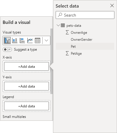
Click the Add Data button for the Y-axis and select the OwnerAge item:

Your chart will then spring to life and look like this:

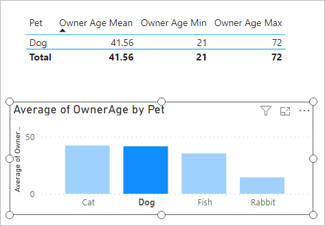
Again, though, Power BI is using Sum to add up all the age totals of the pets. Change it to Average, just like you did with the table. It should look like this:

(Incidentally, the icon under the data flyout is for formatting. We'll do chart formatting in another lesson.)
Now click on any of the bars in your chart. Watch what happens to the tables. They will update to show the information for just that selected bar:
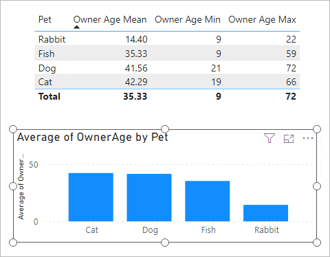
To get all the values back, click a white area of the chart:
And that's it for this quick lesson on Power BI charts. If you enjoyed it, and would like to learn more, click the next lesson below where you'll learn about the card visual.
<--Back to the Power BI Contents Page