Home and Learn: Power BI 2023
Power BI Visuals
In the previous lesson, you learned how to load a simple CSV file into Power BI. In this lesson, you'll learn how to create a Visual from the dataset you loaded.
Visuals
The Power in Power BI comes from its visualizations. These are things like charts, tables, cards, and slicers. Let's add a table.
From the Home ribbon at the top of Power Bi, notice the Insert panel:
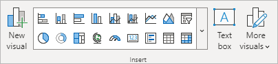
The grid of items are the various visuals you can add to your dashboards. Click the arrow to see a fuller list of the Visuals you can have on your Power BI dashboards:

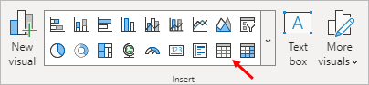
Select the Table item, indicated by the red arrow in the image below:
When you select a visual, you'll see it appear in the dashboard area:
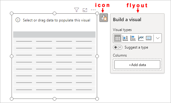
In Power BI 2023, you'll see an icon in the top right of the visual, along with a flyout. Click the icon on and off to toggle the flyout.
As this is a table, we need to add some data for our columns. Click the Add data button to see the Select data panel appear:

Select the Pet item and your table will update:

Another way to add data to a visual is via drag and drop. Expand the Data panel on the right of Power BI. Drag the OwnerAge item from the Data panel to the table:

Let go of your left mouse button when it's over the table. The OwnerAge column will be added to the table:

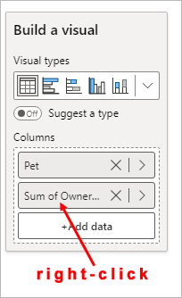
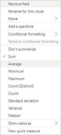
Notice that numbers aren't very helpful. Power Bi is summing up the ages of all cat owners and getting a figure of 296. The heading at the top of the column says, Sum of OwnerAge. This would be better as an Average (mean). To change the calculation, toggle the flyout so you can see the columns again. Right-click where it says Sum of OwnerAge:
From the menu that appears, select Average:
Now look at the values in your table. They have changed to this:

Already, we have some information that we may not have had before - rabbit owners tend to be quite young while cat and dog owners told to be older. (According to our data, that is, which may be wrong.)
Let's add some more columns.
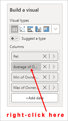
Either drag and drop another OwnerAge item onto your table, or click the flyout icon and the Add data button again, adding the OwnerAge item to the table.
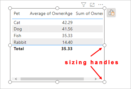
If you look at your table, you may find it's too small. If so, drag one of the white circles to increase the size of your table:

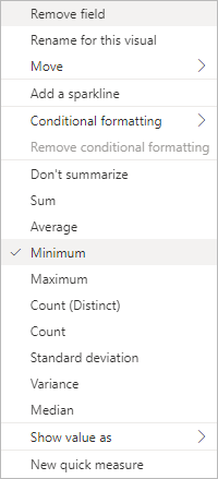
Just like you did for the Average column, change what Power BI is calculating with the new column. Change it from Sum of OwnerAge to Minimum:
Your table should then look like this:

Do the same again, only this time adding a Maximum column. The table will then look like this:

Rather than having those long titles at the top of the columns, you can change them to anything you like.
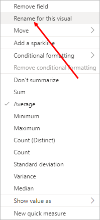
To change the text of a column header, toggle the flyout again, if it's not already open. Right-click on the column text you want to change:
From the menu that appears, select Rename for this visual:
The menu will disappear, and the column name will be highlighted in blue in the flyout:

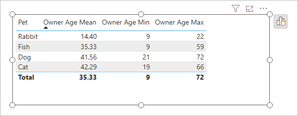
Type a new name and press the Enter key on your keyboard. Your table column header in the table will be renamed. We've called ours Owner Age Mean:

Rename the other column headers in the same way:
You can format your table a lot more. But, because this is a big topic, we'll save table formatting for another lesson. For now, let's add a quick chart. We'll do that in the next lesson below.
<--Back to the Power BI Contents Page