Home and Learn: Microsoft Excel Course
z-scores in Excel
We've done Standard Deviation in a previous lesson. This is when you work out how far from the mean a value is. If your data points are normally distributed, you end up with one of those nice bell curves. Click the link for Standard Deviation, if you need to brush up on all this.
What is a z-score?
Something related to Standard Deviation is a z-score. A z-score tells you have many standard deviations a value is away from the mean. Here's a graph of z-scores, one you'll be producing in this lesson:

You can quickly look at z-scores and see how well (or badly) someone or something is doing compared to everyone else. In the image above, if you had a z-score of -2, it means you're 2 standard deviations below average. You can convert z-scores to percentiles, which we'll do soon. A percentile score of, say, 40% means only 40 percent of the class is doing worse than you, while 60 percent are doing better.
But let's get some work done.
The Data
In the textarea above, there's a hundred numbers. They don't represent anything, but they have a normal distribution, so will give us a nice bell curve later. Anyway, copy all the numbers. To copy the numbers, click into the textarea and press CTRL + A on your keyboard. This will select them all. Now press CTRL + C to copy them to the clipboard.
Open Excel and create a new blank workbook. Click into cell A2 of your spreadsheet and press CTL + V to paste the numbers across. In cell A1, type the text Scores. Your spreadsheet should like this at the top:

OK, we've got some data. Now let's work out the mean of these 100 numbers, and the Standard Deviation.
In cell F1, enter the text Mean. In cell F2, enter the text STDEV.
To get the mean, click into cell G1. Enter the following formula:
=AVERAGE(A2:A101)
Press enter and you should get a figure of 47.31 for the mean.
In cell G2, enter the following Standard Deviation formula:
=STDEV.P(A2:A101)
Press enter and you'll get a figure of 4.47 something in G2:

Note that we're using STDEV.P rather than STDEV.S. That's because we're assuming our numbers are the entire population (P) and not just a sample (S). If we had just a sample of the population, we'd use the formula STDEV.S.
OK, now we have our scores, our mean, and our standard deviation, we can calculate the z-scores.
z-score formula
To work out a z-score, you'll see this formula in statistics:
z = X - μ / σ
Translating that, X is the score or value you're trying to work out (the data in the A column, for us). The mean (μ) is subtracted from this. Then the whole thing is divided by the standard deviation (σ). It's really this:
z-score = (Score - Mean) / SD
So, in cell B1 of your spreadsheet, enter the text heading z-score. In cell B2, enter this formula:
= (A2 - $G$1) / $G$2
Press enter and you see a figure of -2.3 something:

Flood fill the rest of the z-scores, down to cell B101. (To flood fill, hold your mouse over the bottom right corner of cell B2. Your mouse pointer will turn into a black cross. When it does, hold your left mouse button down. Keep it held down and drag down to cell B101.)
Here's what the top of your spreadsheet should look like:

So, the lowest scorer has a z-score of about negative 2.3, meaning this student is over 2 standard deviations below the average. The top z-score is about positive 2.6, meaning this student is more than two standard deviations above average.
An easier way to calculate z-scores in Excel is with the STANDARDIZE function. It looks like this:
=STANDARDIZE(x, mean, standard_dev)
The x is the value you want to turn into a z-score. The mean and standard_dev are pretty self explanatory. In our spreadsheet above, then, we could have had this in cell B2:
=STANDARDIZE(A2, $G$1, $G$2)
A2 is the score we want to turn into a z-score, our mean is in cell G1 and our standard deviation in in cell G2.
Convert z-scores to percentiles
You'll often see z-scores converted to percentiles. You can then say, for example, that a certain z-score is 90% larger than everyone else's z-score. For example, if you were taking the exam, you might want to know how well you did in relation to everyone else. A percentile score of, say, 75%, would mean that you did better than 75 percent of the entire group. If your percentile score was 100% then you came top and did better than everyone else. A score of 0% (or even 1%) means you came bottom, and everyone was better than you.
Let's see how the conversion is done.
In cell C1, enter the text heading Percentiles. In cell C2, enter this formula:
=NORM.S.DIST(B2, TRUE)
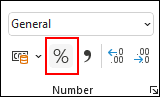
This is the formula for a standard normal distribution. We covered this in a previous lesson. But press enter and you should see a figure of 0.01 something. To convert it to a percentage, click the percent symbol on the Number panel of the Home ribbon:
You should now see 1% in cell C2, meaning this student was bottom of the class! Flood fill the test down to cell C101. Cell C101 should have a percentile value of 100%, meaning this student was better than everyone else. A percentile figure of 77% means these students were better than 77% of their classmates:

Percentiles and their z-scores are the same, regardless of your data. Because of this, percentile tables are widely available. Once such table can be found here:
Percentiles and z-score Table (opens in new browser tab)
If you want to work out a particular percentile, say 75%, you can use either of these Excel functions
=PERCENTILE.EXC
=PERCENTILE.INC
For example, with our scores, we might want to know what score represents the 75 percentile. In which case, enter this somewhere on your spreadsheet:
=PERCENTILE.EXC(A2:A101, 75%)
Or this:
=PERCENTILE.INC(A2:A101, 75%)
Press enter and you'll get a score of 50.75. This means all scores below this come within the 75 percentile. A score of, say, 52 means you score was above the 75th percentile.
The difference between the two functions is that PERCENTILE.EXC excludes 0 and 100 percent. The INC version includes 0 and 100 percent.
What percentile was your score?
You can work out what percentile your score was with the Excel function PERCENTRANK
=PERCENTRANK.EXC(A2:A101, 49)
Here, we want to know what percentile rank we are with a score of 49. The scores themselves are in cells A2 to A101. (Again, there's an INC version, which is the same as above.) Press enter and you'll see a percentile rank of 59% when you convert the cell to a percent rather than general.
OK, let's do the normal distribution figures. Once we've got them, we can make our bell curve graphs.
Bell curve graphs
In order to create a bell curve graph in Excel, we need some normal distribution figures. So, in cell D1 of your spreadsheet, enter the text heading Norm Dist. In cell D2, enter this formula:
=NORM.DIST(A2, $G$1, $G$2, 0)
We covered this formula in another tutorial, which is here: normal distribution formula.
Press enter, though, and you should see a figure of 0.006 something. Flood fill the rest down to D101. Your spreadsheet should look like this:

Now select all the normal distribution figures, from D2 to D101. Hold down a CTRL key on your keyboard and select the scores, from A2 to A101
With the two columns selected, click on the Insert ribbon at the top of Excel. From the Charts panel, click the Scatter Chart icon:

From the Scatter charts dropdown, select the smooth lines one:

When you select the chart, you should see a bell curve graph appear:

It looks a little cramped, though. Excel will start a chart at 0, even if your chart data doesn't start at 0 on the x-axis. Ours starts at just after 30. We can fix that.
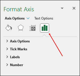
Double click on the horizontal numbers at the bottom of the chart (the 0, 10, 20, 30, etc, number)). The Format Axis panel should appear on the right of Excel. Make sure the little bar chart icon is selected:
Expand the Axis Options item. For the Minimum, under Bounds, type 35. For the Maximum, type 60:
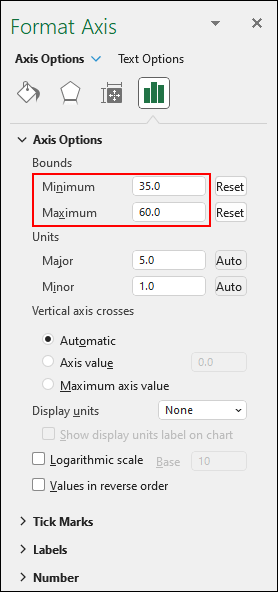
Your chart should now look like this:
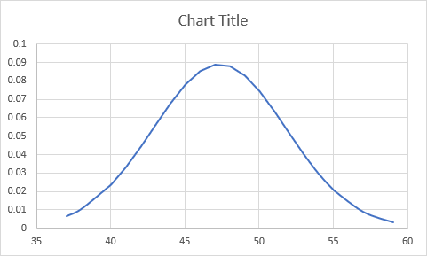
Much better!
You can add some lines to indicate where your mean is, and your standard deviations. But you have to add the lines yourself. Excel won't do it for you, sadly.
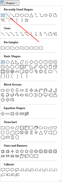
The line tool is also on the Insert ribbon. You can find it on the Illustrations panel, Shapes. Click the dropdown for Shapes and then select the line tool:
Draw a line on your chart to represent the mean, which is just slightly more than 47. (You can draw a vertical line by holding down the SHIFT key on your keyboard. Let go of your left mouse button first, then the SHIFT key. Otherwise, you'll have a slanted line.)
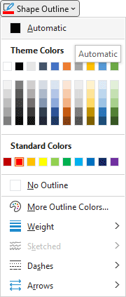
With your line selected, you can format it from the Shape Format ribbon. Use the Shape Outline dropdown to change the color and weight of your line:

Draw some dashed lines for the standard deviations. One standard deviation is 4.47. Deduct this amount from the mean to get 42.8. Round it up to 43 and draw a new line from this point. Add 4.47 to 42.8 to get 52 when rounding up. Draw a line at 52 upwards. This will you get 1 standard deviation above and below the mean, and your chart might look like this:
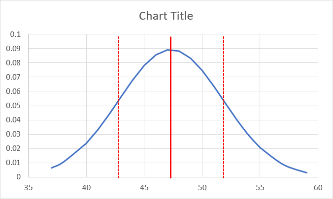
Format your chart some more and you might have something like this:

There's an easy way to add charts in Excel. On the Home ribbon, click on the Analyze Data item on the Analysis panel (right at the end). You should then see a new panel appear on the left. Scroll down and you'll see a chart with the z-scores at the bottom:

Click the Insert Chart button to add the chart to your spreadsheet:
Scroll down right to the bottom of the Analyze Data panel on the right and you'll see a link for Show all 9 results:

Click this link and you'll see the normal distribution chart we've just added above:

You can format this version just like you did before.
And that's it for z-scores. Hope you had fun! In the next lesson below, you'll learn about something called Confidence Intervals. This is to do with how confident you are that the samples you've grabbed are a match for the population Mean.
Excel Confidence Intervals -->
<--Back to the Excel Contents Page