Home and Learn: Microsoft Excel Course
Replace boring bars and columns in your Excel charts with images
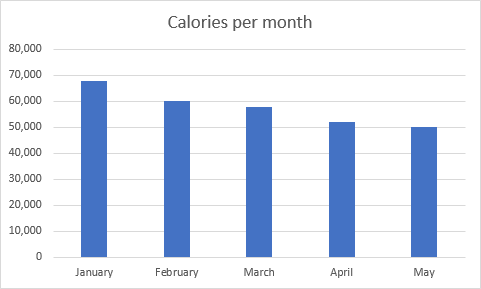
Columns and Bars in charts are pretty common, but can look rather dull. You can spruce up your charts, however, by replacing the columns or bars with images. For example, here's a column chart that displays calories consumed in a month:
All rather standard. Now here's the same information but with images in place of the columns:

The second chart looks far more lively! So, how is it done?
First, create the following simple spreadsheet:
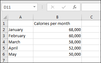
Select the data from cell A1 to B6.
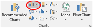
With the data selected, click on the Insert ribbon at the top of Excel. From the Insert ribbon, locate the Charts panel and the Column or Bar chart item:
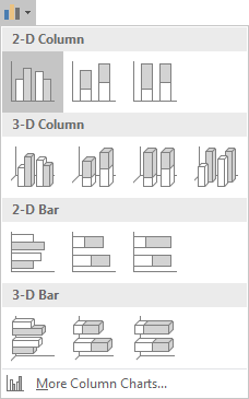
From the dropdown list, select the first 2-D column chart:
You will then have a plain column chart like the one at the top of this page.
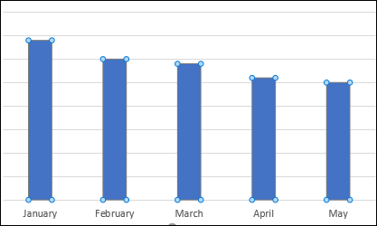
Select any of the columns in your new chart so that you see the round sizing handles on each column:
With the columns selected, right-click to see the following menu:
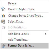
From the menu, select Format Data Series. This will bring up a side panel on the right in modern versions of Excel. This one:
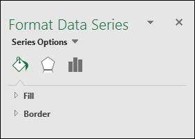
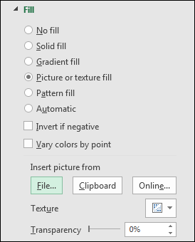
Make sure the paint bucket is selected, which is the first of the three icons above, Fill & Line. Expand the Fill item to see the following options:
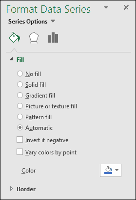
One of the Fill options is Picture or texture fill. Select this options and the menu will change to this:
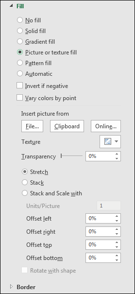
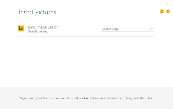
There is now an item with the heading Insert picture from. Under this heading are three buttons: File, Clipboard, and Online. If you're connected to the internet, click the Online button. You'll then see the following screen:
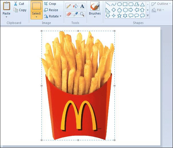
The search engine Excel uses is Microsoft Bing. Type something in the box and press the enter key on your keyboard to do a search. We've typed MacDonald's fries:
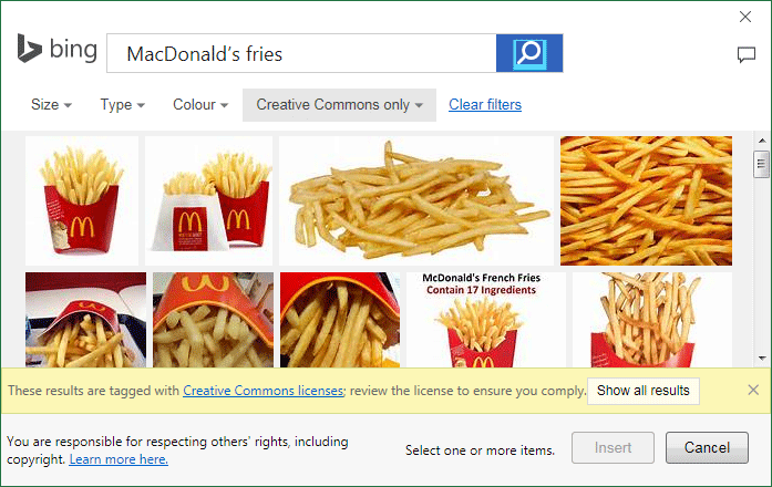
Scroll down to see more images. Once you've found a picture you like, select it. You'll see a check mark in the upper left corner of the image:

However, there is a problem with the image we have selected. If you look closely at the top and bottom of the image, you'll see there's some white space. If we inserted it like this, the image wouldn't align properly with the values in the chart. Take a look at the chart below:
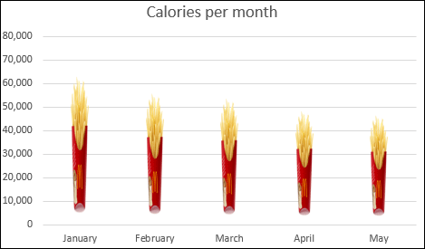
Ignore the fact that the images are too narrow, as we'll fix this soon. Instead, focus on the 0 line at the bottom. The images are not touching it; they start closer to the 10, 000 line than they do the 0 line. And the top of the image for January is supposed to be at the 68, 000 mark, but it barely gets of the 60, 000 line. This is because of the white space. In the image below, we've clicked on the images to select them:
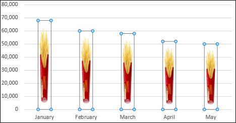
With the columns selected, you can see the white space more clearly.
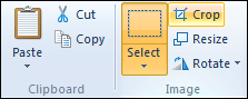
To fix this, you need an image that goes right to the top and bottom. What we did is to do a Bing search using Internet Explorer. We then saved an image to our own computer. The image was then opened up in Photoshop and cropped. If you don't have Photoshop, you can use a free Image Editing package to do your cropping. For example, open up your image in Microsoft Paint, which you can do a search for in Windows 7 to 10.
Once you have opened the image in Paint, click the Select button on the Ribbon at the top.
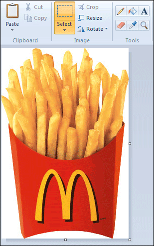
Now make a selection around the image:
Here, we've made a selection as close to the image as possible. Then click the Crop button:
Once you click Crop, the white space should vanish:
Click File Save As, to save your cropped picture to your own computer. Save it as a PNG file or GIF.
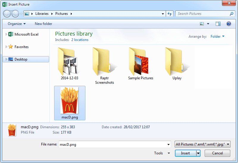
Now go back to Excel, and click the File button under Insert picture from:
Clicking the File button allows you to search your own computer for a picture. Navigate to where you saved your cropped image and click Insert:
When you are returned to Excel, your chart should look like this:
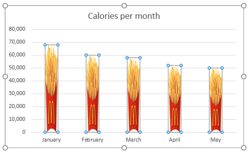
Notice how the columns now go right down to the 0 line. At the top, the January image is nicely aligned with the 68, 000 value.
However, the image is too squashed. To remedy that, with your columns selected, click on the Series Options icon in the Format Data Series panel on the right:
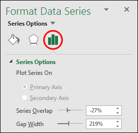
Move the Gap Width slider to the left:
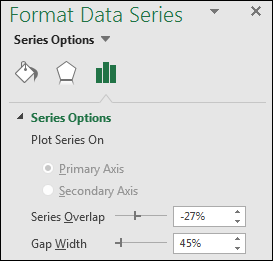
A value of 45% works well for this image. The chart would then look like this:
And that's it - images as columns in your charts. Play around with the various options on the Format Series Data sidebar. See what you can come up with to impress everyone!
In the next section, we'll move on to Formulas in excel.
<--Back to the Excel Contents Page