Home and Learn: Data Analysis
Pandas Plots
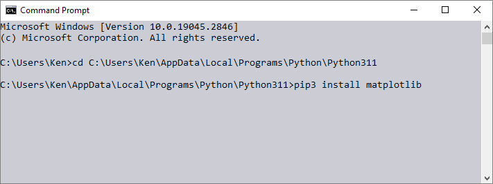
In this lesson, we'll start charting our data as create a few Pandas plots. We'll assume you're using a Jupyter Notebook to do these tutorials. This will make life easier, as it has plotting built in. However, you do need to install something calledMatPlotLib. So, fire up your command prompt again. (If you're not sure what this means, see the first lesson here: install.) Navigate to your Python directory. Enter this command:
pip3 install matplotlib
It should look like this in your command prompt:
Let's load our student data again. If you haven't already downloaded this dataset, you can grab a copy here:
Student Scores Data Set (right click, Save As)
Load the dataset and display the first five rows with these lines (change PATH_TO_FILE to point to a location on your own computer):
import pandas as pd
df_students = pd.read_csv('PATH_TO_FILE\\StudentScores.csv')
df_students.head()
Let's just extract the Math column (columns are called Series, remember) and see what happens when we plot it. Add this line in a new cell in your Notebook:
df_students['Math'].plot()
Run the line to see this plot appear:

Using the inbuilt function plot gets you a line chart by default. If you want another type of chart, you can use one of the following:
plot.area()
plot.bar()
plot.barh()
plot.box()
plot.hexbin()
plot.hist()
plot.kde()
plot.density()
plot.line()
plot.pie()
plot.scatter()
So a line chart would be this:
df_students['Math'].plot.line()
Our chart is a a bit messy, though. Let's add the grade columns to our Dataframe, like we did in a previous lesson. First, add this Python function to a new Notebook cell:
Make sure to run the code so that Pandas knows about it.
def getGrade(val):
    if val >= 90 and val <= 100:
        return "A"
    elif val >= 70 and val <= 89:
        return "B"
    elif val >= 50 and val <= 69:
        return "C"
    elif val >= 30 and val <= 49:
        return "D"
    elif val >= 10 and val <= 29:
        return "E"
    else:
        return "F"
It should look like this in your Notebook:

Now add these lines in a new cell:
df_students['MathGrades'] = df_students['Math'].apply(getGrade)
df_students['PhysGrades'] = df_students['Physics'].apply(getGrade)
df_students['CompGrades'] = df_students['Computers'].apply(getGrade)
df_students.head()
When you run the code, you should see the first five results:

Let's put the Math grades into a series of their own and then plot them. Add the following to a new Notebook cell:
seriesMath = df_students['MathGrades'].value_counts()
.sort_index(ascending=True)
seriesMath
You should see this when the code is run:

The code uses value_counts to get a count of how many students are in each grade. (We're adding a sort on the end.)
We can now create a bar chart. In a new cell, add and run this line:
seriesMath.plot.bar()
You'll see this:

Here's the code to create a bar chart from the Physics grades:
seriesPhys = df_students['PhysGrades'].value_counts()
.sort_index(ascending=True)
seriesPhys.plot.bar()
And here's the code for the Computers grades:
seriesComp = df_students['CompGrades'].value_counts()
.sort_index(ascending=True)
seriesComp.plot.bar()
Make sure to create these two series, seriesPhys and seriesComp, by running the code - we'll be needing them soon.
The charts look a bit bland, though. You can spruce them up by including a few attributes between the round brackets after the plot type. Here are just a few of them:
| Attribute | Value | Example |
| figsize | tuple | seriesMath.plot.bar( figsize=(7, 7) ) |
| grid | bool (True/False) | seriesMath.plot.bar( grid=True ) |
| legend | bool (True/False) | seriesMath.plot.bar( legend=True ) |
| xlabel | string | seriesMath.plot.bar( xlabel='Grades' ) |
| ylabel | string | seriesMath.plot.bar( ylabel='Num of Students' ) |
| color | color value | seriesMath.plot.bar( color='red' ) |
| fontsize | float | seriesMath.plot.bar( fontsize=20.5 ) |
For the color, it can be a name, as in the example above, a hex value like #00ffff. You can also use an RGB value like this:
color=(.5,1,0)
The RGB values are from 0 to 1, rather than 0 to 255 as you may be used to. You can also use an alpha on the end:
color=(.5,1,0, .2)
Let's try a few of the examples out, though. Add this code to a new cell:
seriesMath.plot.bar(figsize=(8,8),
                    grid=True,
                    legend=True,
                    xlabel='Grades',
                    ylabel='Num of Students',
                    color='#992323',
                    fontsize=20)
We've added line breaks in the code, as it makes it easier to read. Pandas doesn't care about line breaks. Note where all the commas are, though. Here's the result:

Pandas Bar Charts - More than one column
You can have more than one column in your bar charts. For us, we have three subjects we'd like to display in our bar chart: Math, Physics, Computers. The best way to tackle the problem is by creating a new Dataframe object and assign our three series to it. That's easy enough. Add this code to a new Notebook cell:
newDF = pd.DataFrame(columns=['Math', 'Physics', 'Computers'])
newDF['Math'] = seriesMath
newDF['Physics'] = seriesPhys
newDF['Computers'] = seriesComp
newDF
We first create a DataFrame. In between the round brackets of DataFrame, type the name you want for your columns. This needs to be a list, hence the square brackets.
The next three lines assigns thos individual series we set yo each new column.
You should see this when you run the code: (If you get errors when running the code, it means you didn't set up the series.)

The numbers are how many students are grouped in age grade. So, 8 students got an A in Math, 18 students got an A in Physics, while 9 students got an A grade in computers.
Let's see all this in a bar chart.
Add the following in a new Notebook cell:
newDF.plot.bar( y=['Math', 'Physics', 'Computers'] )
The result is this, when you run the line:

We have a nice bar chart with all three subjects compared for each grade.
Notice what we have between the round brackets of bar:
y=['Math', 'Physics', 'Computers']
We're specifying which columns from our new Dataframe that we want to use in the y axis.
You can also add a column name that you want to use in the x axis, if you need to:
bar(x='Grades', y='GradesCount')
Often, you don't need to specify the y column as Pandas usually guess right which column to use.
bar(x='Grades')
We can add some formatting to our chart, though. Try this:
newDF.plot.bar(y=['Math', 'Physics', 'Computers'],
               figsize=(8,8),
               legend=True,
               xlabel='Exam Grades',
               ylabel='Num Achieving Grade',
               color={'Math': '#003f5c',
			'Physics': '#bc5090',
			'Computers': '#ffa600'},
               fontsize=20)
Run the code to see the updated chart:

Notice how we've specified the colors for the bars:
color={'Math': '#003f5c', 'Physics': '#bc5090', 'Computers': '#ffa600'}
We have curly brackets after the color attribute. Inside of the curly brackets, we have a column name, a colon, then a color value:
"Math": '#003f5c'
Each of the column names and their color values are separated by commas.
But that's enough of charts and the end of this Pandas short course. Hope you enjoyed it. If oyu want to take Pandas further, there's a webiste called Kaggle that's a great place to go to get datasets. Not only that, others will upload the code they used to analyse the dataset, so you can learn from them. Look for the link on the left of the site that says Code. Here's the link:
Good luck. And get in touch, if you'd like to see more tutorials on Python and Pandas.