Excel Pivot Charts
In this lesson, you'll learn how to create a Pivot Chart. A Pivot Chart is a way to visualise the data from your pivot tables. Just like in a pivot table, a pivot chart allows you to filter data. They are quite powerful, and can make you look like an Excel expert, without too much work!
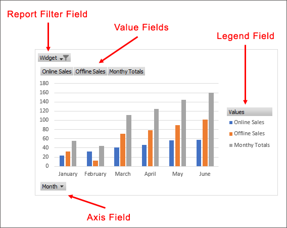
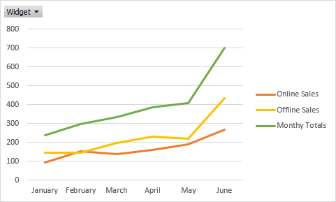
Examine the chart below:
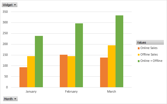
The filter is in the top left, the one that says Widgets. When the filter is clicked a dropdown box will appear with a list of options:
Select an option and your chart will then be updated:
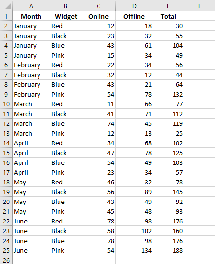
Let's create a new pivot table for this. You can download the data for the pivot table here: (Right click the link and select Save Target As or Save Link As.)
Once you've downloaded the XLXS file, open it up in Excel. You should see this data:
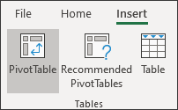
Select all the data from cells A1 to E25. Now click on the Insert ribbon at the top of Excel. From the Insert ribbon, locate the Tables panel on the left and click on PivotTable:
You should see this dialog box appear:
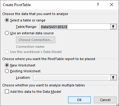
Make sure you have Data!$A$1:$E$25 selected in the Table/Range area at the top. Click OK and you'll be taken to a New Worksheet.
In the area on the right of Excel, select the top four items (Month,
Widget, Online, Offline). Leave the Total unchecked as we'll
create a Calculated Field for this:
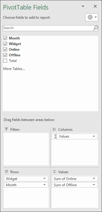
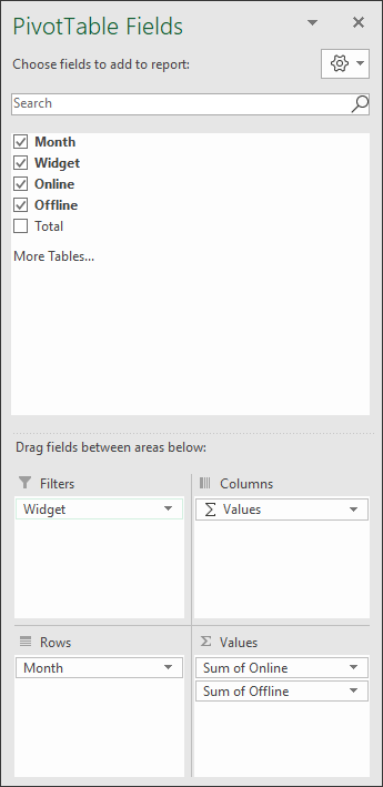
In the area at the bottom, under Rows, drag the Widget item into the Filters box:
When creating your own Pivot Tables, think about your data. What are the main options you want to filter on? For our data, it's about the widget we sell: Black, Red, Blue and Pink Widgets. In the previous Pivot Table we created, we had a list of students and their exam scores. So it makes sense that the main options to filter on, the ones that go at the top of a Pivot Table, are the students.
But your Pivot Table should look like this on the Excel spreadsheet:
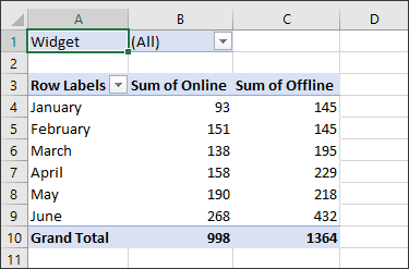
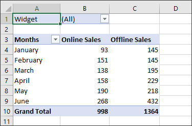
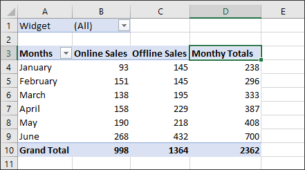
The headings on row 3 are not very relevant. Click inside of cell A3 and type Months instead of Row Labels. Instead of Sum of Online, type Online Sales. Instead of Sum of Offline, type Offline Sales. Your Pivot Table will then look like this:
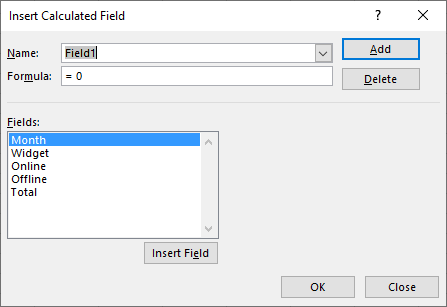
Let's do something called a Calculated Field for the total sales each month. This will go in the D column, just to the right of Offline Sales.
Pivot Table Calculated Fields in Excel
A calculated field is a formula derived from your data. For example, on row 10 of our Pivot Table, we have the Grand Totals for the Online Sales and the Grand Totals for the Offline Sales. What we don't have are the totals for the months. We'd like to know how many sales were made in January, how many in February, etc. This is just a simple sum. Let's see how it works.
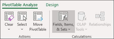
Click on any cell in your Pivot Table, cell B4, for example. In the
Ribbons at the top, select the PivotTable Analyze ribbon. (It's
right near the end, just before the Design ribbon.) On the PivotTable
Analyze ribbon, locate the Calculations panel. On the Calculations
panel, select the Fields, Items & Sets item:
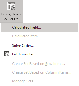
From the Fields, Items & Sets menu, click on Calculated Field:
When you click on Calculated Field, you should see this dialog box appear:
What you're trying to do here is to construct a formula. Ours is a simple one: Online Sales + Offline Sales.
In the Fields list, click on Online and then click the Insert Field button:
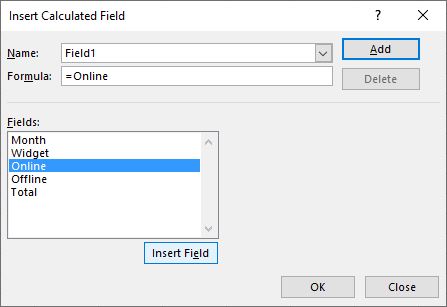
When you click the Inset Field button, you should see = Online appear in the Formula box. Click inside the Formula box and type a + symbol after the word Online. In the Fields box, select the Offline item and click the Insert Field button again:
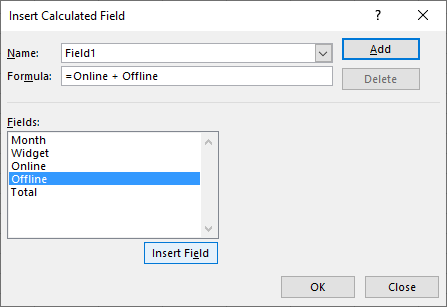
When your dialog box looks like the one above, click OK. Excel will update your Pivot Table. It should look like this:

Click inside of cell D3 and change the default heading from Sum of Field1 to Monthly Totals:
Now that we have our Pivot Table, we can create a Pivot Chart from it. It's quite easy!
Create a Pivot Chart in Excel
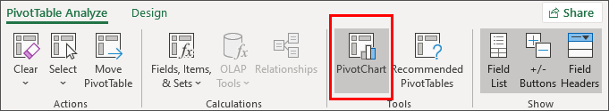
Click anywhere inside of your Pivot Table. Cell B4 is a good choice. Now click on the PivotTable Analyze ribbon again. On the Tools panel to the right of the ribbon, select the PivotChart item. Here's the right side of the PivotTable Analyze Ribbon:
When you click the PivotChart item, you should see this dialog box appear:
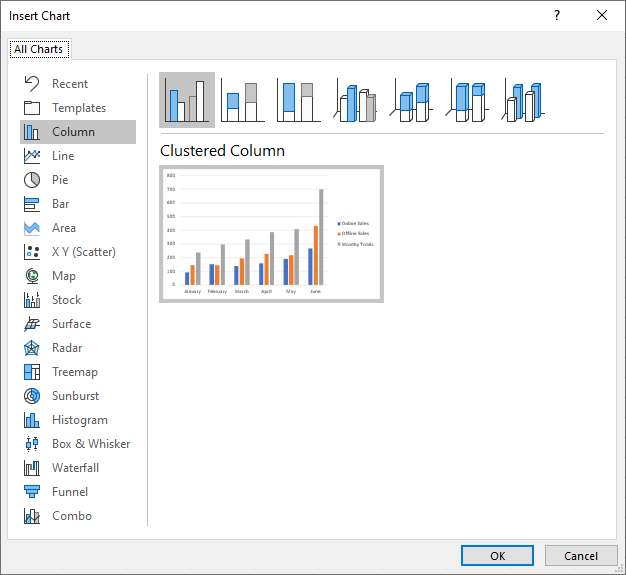
The default is for a Clustered Column chart. Leave it on that and click OK. We'll change it to a different chart type soon.
When you click OK, you should a chart like this one:
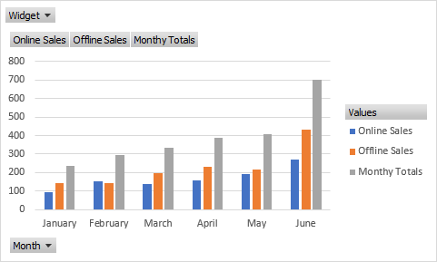
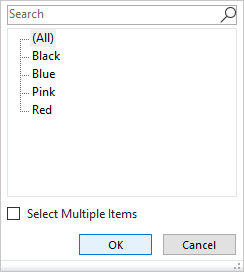
At first glance, it looks just like a normal chart, and you might be thinking, "Big deal!". But the power of a Pivot Chart lies in its filters. Click on the Widget filter at the top left of the chart. You'll see these options:
![]()
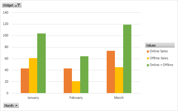
Select the Black widget and click OK. Your chart will update to show only the sales figures for the black widgets:
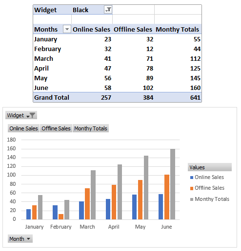
Look at the pivot table at the top of the chart, in the image above. Because you selected Black Widgets in the pivot chart, the pivot table displays only the figures for Black Widgets.
You can do it the other way round. Select a filter in the pivot table and the chart will be updated. The two are linked.
The only other filter is at the bottom, on the left. Click the Month button to see a list of months to filter on. Select the months you want to display on your chart.
You can remove buttons from your charts. For example, the Online Sales,
Offline Sales and Monthly Totals buttons don't do anything. We can get
rid of them. On the PivotTable Analyze Ribbon again, locate the Field
Buttons item on the Show/Hide panel:
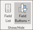
(The Field List button to the left of Field Buttons, by the way, shows or hides the PivotChart Fields on the right. If it's highlighted, click it to see what happens.)
Click on Field Buttons to see the following menu:
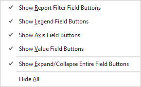
Check and uncheck the four options at the top to see what they do:
If you don't like the colour scheme used for your chart, you can easily change it. With your chart selected, click on the Design ribbon at the top. From the Design ribbon, locate the Change Colors item to the left of the Chart Styles panel:
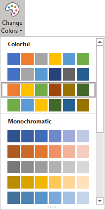
Select a colour scheme for your chart. (Just like the formatting you did in the Chart section of this course, you can right click a bar in your chart. Then select Format Data Series from the menu that appears. A panel will appear on the right of Excel. Click the paint bucket and expand the Fill section. Select a colour for the bars.)
Stay on the Design ribbon and have a look to the right. You should see a panel called Type. Click on Change Chart Type:
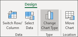
When you click Change Chart Type, you should see the dialog box with all the different charts you can have. This time, click on Line:
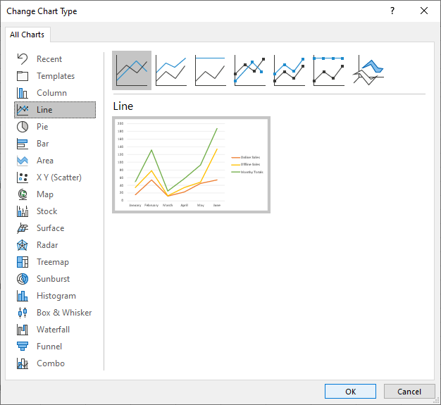
Click OK and your chart will change:
A pivot chart, linked to a pivot table, it can be quite illuminating. For example, select the Pink widget. The chart will look like this:
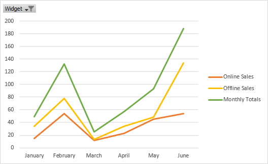
You can quickly see that sales of Pink widgets dipped dramatically from February to March. Without a pivot chart, it might have been difficult to spot.
So that's Pivot Charts. They are well worth getting to grips with, and are not too difficult. If you have a presentation to give, a good pivot chart can make you look like an Excel guru! In the next lesson, you'll learn how to reference other Excel worksheets.