Home and Learn: Android Course
Lesson Updated July 2023
Android Buttons
In the previous lesson, you added a Linear Layout to your design surface. We'll now add two buttons to this layout.
Go back to the palette. Locate the Buttons category. Click on this and you'll see a Button item. Drag two of these onto your LinearLayout in the Component Tree:

Here's what the Blueprint will look like, after you've added the buttons:

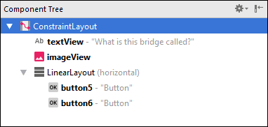
And here's what your Component Tree looks like after you've added the buttons:

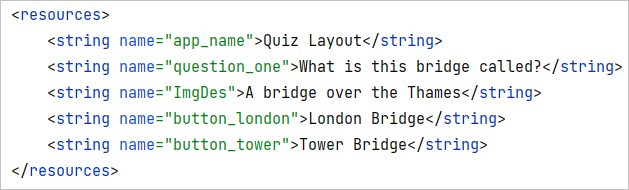
Notice that we have the yellow warning triangle again. The warning is because of the hardcoded text issue again. In your strings.xml file, set up two strings, just like you did in a previous lesson. As the text for the strings, add London Bridge and Tower Bridge. For the name attributes, set them as button_london and button_tower. Here's what your strings.xml file should look like:
In the Component Tree, select the first button. In the properties area on the right, scroll down and locate the text property. Click the little button to the right of text:
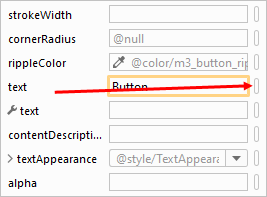
From the Pick a Resource dialog box that appears, select you button_london item. Repeat the process for your second button, this time selecting the button_tower item as the string resource.
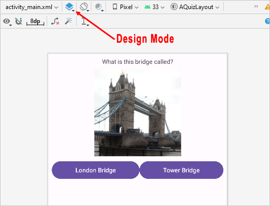
In Blueprint mode, notice that the buttons are regtangular. However, switch to Design mode and you'll see that they are actually round. They may even be purple:
There are lots of button styles built in to Android. Let's select a different style.
In the Attributes panel on the right of Android Studio, scroll down and locate the style attribute:

The default button style is Widget Material3. Click the dropdown to reveal more styles. Scroll down and select the Android Widget Button one:

The button will change shape:

Notice, however, that although we now have a rectangular button, it's still purple! Let's change that.
Changing Widget Colors in Android
The reason the button is purple is because that is the default color theme for all widgets. You can override the default colors for widgets like button, though. It's a bit fiddly, as we'll have to add a value to the colors.xml file.
In the Project Files area on the left of Android Studio, expand the res > values folder:

Double click the colors.xml file to open it up. Add a new color name. Add this:
<color name="grey">#DEDEDE</color>
The colors.xml file should then look like this:

The name of the color is grey. This is a name we chose. You can call your colors anything you like. The value for the color goes between the color tags and is #DEDEDE. This is a hexadecimal color value. If you want to go with something else, search on line for a color picker. Copy and paste a new hexadecimal value in place of the grey one we've chosen (you can have lower or uppercase character hexadecimal value ).
To apply the color to your button, go back to the activity_main.xml file. In the attributes are on the right of Android Studio, locate the backgroundTint attribute:

Click the little white button to the right of the backgroundTint text area. This wil bring up a dialog box where you can select a color:
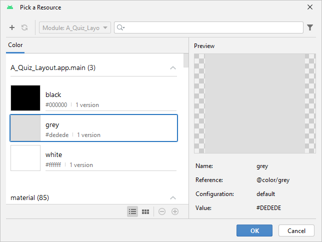
Notice that the grey color we just added is on the list. Select that one and click OK.
When you click OK, you may very well find that your button is still purple! To solve the problem, we have to do a bit of XML hacking again.
Click the Code icon in the top right of Android Studio, just above the Attributes panel:

Locate this line:
android:backgroundTint="@color/grey"
Change it to this:
app:backgroundTint="@color/grey"
So just the one small change, from android to app. This is enough to override the android default theme. But you XML code should look like this:

Click back into Design view rather than Code view. Your button should have changed color:

Repeat the whole process for the second button and you'll have this:

Almost done, now.
You can change the background colour of the ConstraintLayout to something other than white.
Make sure you are in Design View rather than Blueprint View. In the Component Tree, click on the ConstraintLayout item to select it:
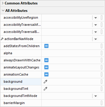
Now look at the properties area on the right. Expand the All Attributes item:

You'll then see a fuller list of properties. Locate the background property and click just to the right of the word background, where the white box is in the image below:
Click on the white square to bring up a dialogue box. Select the Color tab at the top:

You'll see the colors from the colors.xml file, along with the grey one we set up. We could have set up another color for the app background. But scroll down and select one that takes your fancy. In the image above, we've gone for holo_blue_dark.
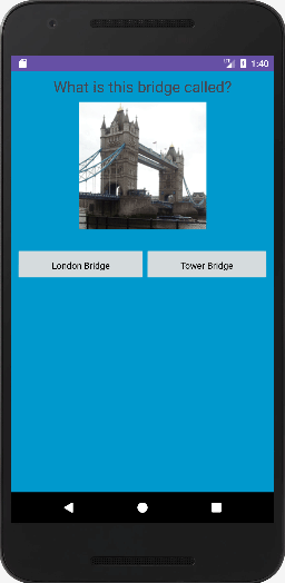
Try it out now. Run your app and see what it looks like. You should see something like this:
Rotate your device and you'll see that the buttons in the layout expand to fill the space:

If your buttons don't look right, if they are too far up the screen, stop your app from running. In Design view, click the Linear Layout item in the Component Tree. In the Attributes panel on the right, makes sure the layout_width and layout_height are both set to 0dp. If not, change then via the dropdown list:

Run your app again and the buttons should be fine.
However, if you're using a real device, your app will probably crash on rotation. You'll see why, and how to fix it, later in the course, when we move on to Activities.
In the next lesson, you'll learn about the XML file. You'll also learn how to add XML strings. You can skip this page, if you want, as we've already went over a lot of it. But it's nice to have it all in one place!
< Linear Layouts | Android XML Strings >
Back to the Android Contents Page